That sometimes happens to me on iPhone, I either hit return, move the window to show the right side and then hit the post numbers to bring up the scroll bar, or I hit the jump to box at the bottom and enter the number of the last post. Minor annoyance but only minor.
In this case, it wasn’t a bug and it didn’t do this to me, though of course that was my first thought. I had actually used the “touch screen finger spread” maneuver to zoom in and read something easier and forgot I did that.
we can’t control user error. How do we stop @Dav3_Dyr0ff from zooming in too far and forgetting? Do we change apple IOS so it doesn’t allow zoom? Do we hack into dave’s brain to tell him to stop forgetting?
Welcome to being IT, Charlie. You are now responsible to foresee each and every single individual’s hardware AND software idiosyncrasies. Not predicting all possible issues, tastes and peculiarities means you are a failure and possibly a jerk.
Ship @Dav3_Dyr0ff a bunch of Chave, Jamet, Juge and Gonon. That seems like the best solution to try first. If that doesn’t work, I’ll try rebooting my machine.
Clicking on the time of last post when viewing a list of threads? Still works for me. Inside a thread, clicking on the time brings up the sharing bubble.
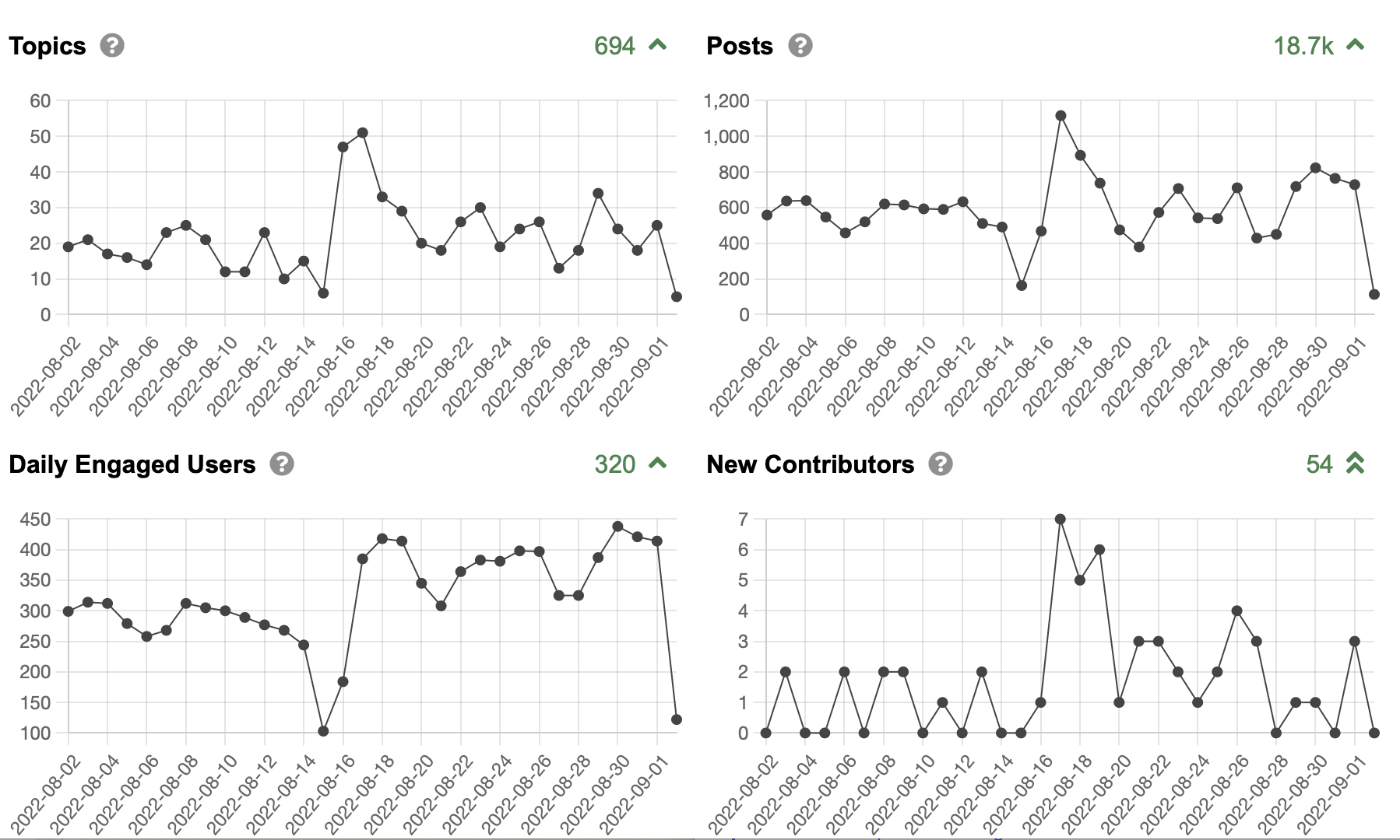
(note that because the server is in Europe, it’s already ‘tomorrow’ for the chart, as it uses the server’s time zone for the data, hence the drop, which is starting Sept 2’s data)
I’ve gotten pretty used to it. My main complaint is that the mobile version user avatar (using l”latest” view) is such a big circle compared to print. So I sometimes toggle to the desktop view even on mobile.
Why such a big circle for the user on Mobile? Way to high an ink:information ratio.
Just have it display smaller like in desktop view.
It’s at the smallest readable setting now. Do you have a screenshot? I wonder if you have your browser upsized in a big way, not just larger text but zoom on everything on your phone to make it more readable? If so I suggest changing only default font sizes, not zooming everything 1.5x, etc
I sent screen shots. If you compare desktop vs mobile latest view, you will se what I mean. It’s at your end, not mine I think. On iPhone 13, desktop latest view looks great, mobile not so hot. But can’t edit on desktop using iPhone.
I’m loving the other functionality, and I’m a slow learner so great job!
Barry, one suggestion, which is what I do, is to stay in desktop view most of the time, and switch to mobile only for those few functions which don’t work properly with desktop on a mobile device. It’s so easy to toggle back and forth, I just do that the rare times I need it.
Thanks, it’s a food option that I use, but it’s a bit too often since editing sucks in desktop mode on a mobile device. Unfortunately , I never get it right the first time.