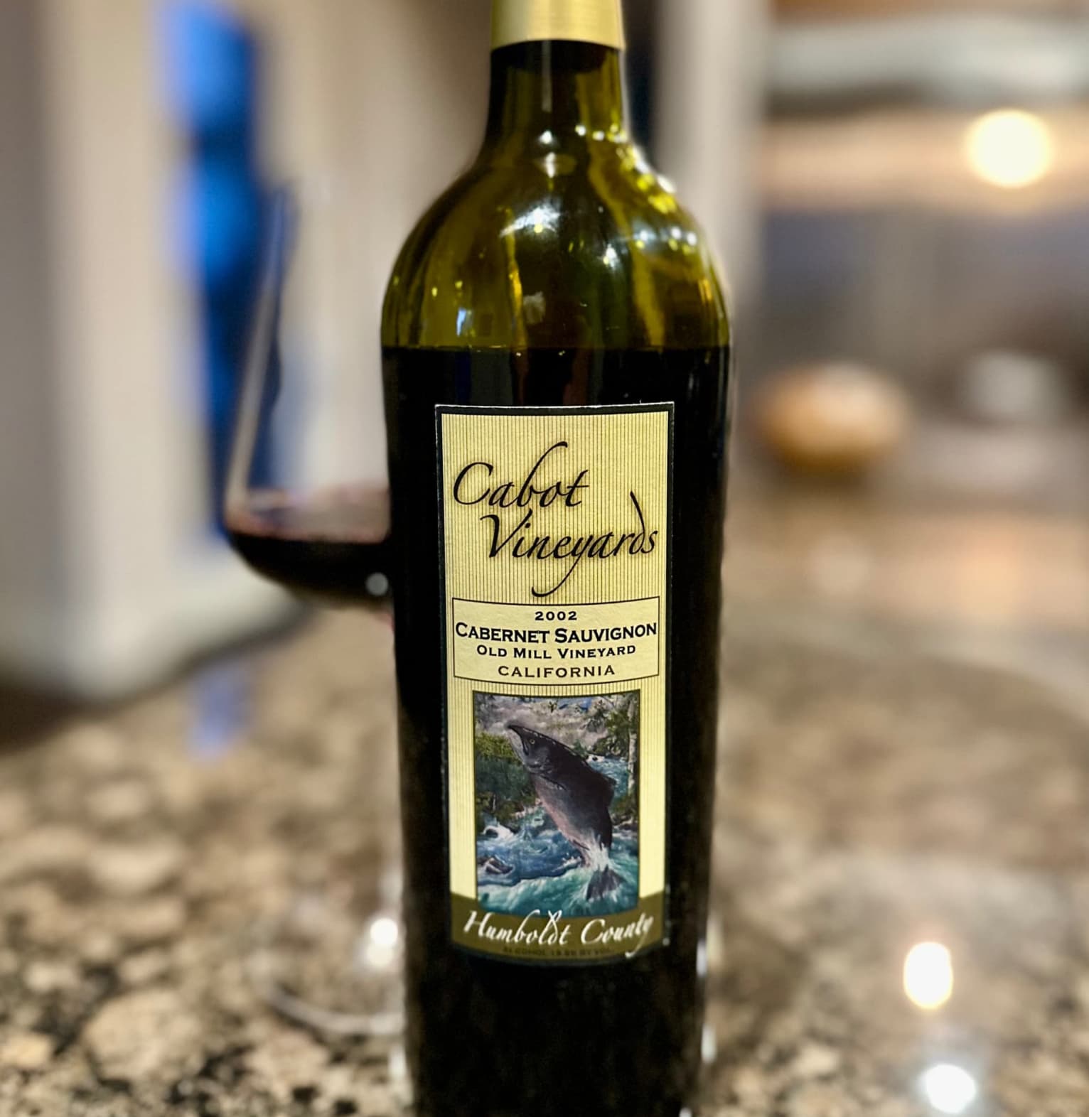
Already too much negativity floating around, but I feel we need a thread about wine labels people have… strong feelings about. Positive AND negative. Like this one. I might be OK with this on a bruiser SLH, but… a Burg?
8 Likes
Absolutely hideous ![]() So hideous it’s amusing
So hideous it’s amusing
4 Likes
I was thinking about that exact label when I read the thread title - worst label of all time!
2 Likes
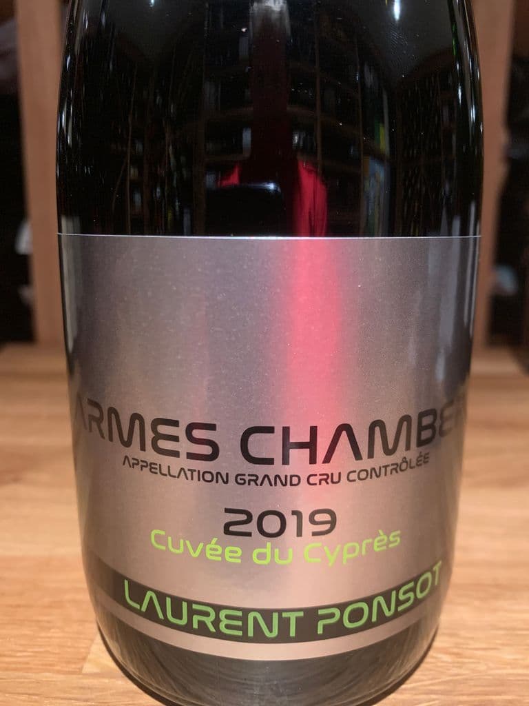
I know everyone hates the Star Wars Ponsot labels but they’ve grown on me and I kind of love them now ![]()
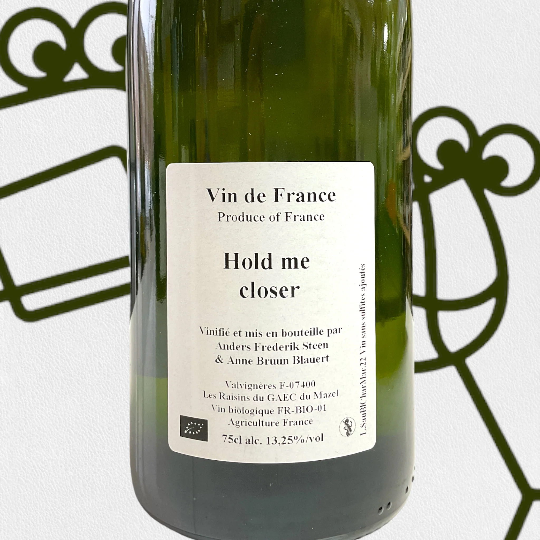
Shout out to Anders Frederik Steen labels as well in the “so bad it’s good” category
3 Likes
I rather like that. Succinct, to the point and with all relevant information. No BS. Wish more labels were like that.
1 Like
A front label that looks like a back label.
No matter how the bottles look, I wish the wines were good (I haven’t had a single Steen wine I liked).
And the Ponsot Techno Disco Star Wars labels are just pugly. ![]()
1 Like
Lots of string here on this subject …
3 Likes
As I also posted in the recent most beautiful labels thread, the Ponsot label is really out there and i wonder what on earth led to that decision. It’s so far off that I don’t understand it.
When it comes to AFS, I find his labels to be very beautiful even though his wines may not always be fully there. He’s a very honest and nice guy.
Otherwise Billecart Salmon, Comtes des Champagnes & 2014 Jean Luc Jamet to name a few.
Bouchard(RdJ). Somebody thought it was a great idea to butcher a perfectly fine label.
2 Likes
Is that wine made by Tony Danza?
3 Likes
Perhaps not rising to the level of shame, I for one think a number of Bordeaux producers have definitely taken a step back in aesthetics with recent label changes. Haut Bages Liberal is one example. Definitely not an upgrade.
Laurent Pongsot.
2 Likes
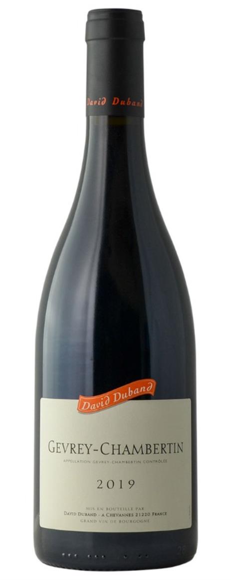
I actually do hate the Duband labels because they look so boring and cheap. I’ve had many a wine store owner tell me that they sit on the shelves longer than their Burgundy compatriots. Would look so much better without the orange banner.
8 Likes
+1 on this. Really dislike the way it’s done now. The previous labels were more elegant
Did they hire a Veuve Cliquot intern for that label?
1 Like
Told the owner of the Chateau, who I thought was just a rep, I thought the labels were awful at UGCB in Chicago. ![]()
3 Likes
100% agree. Taste great, look incredibly boring. I’d never buy me a bottle unless I knew how great they are.

Lol yes