
1 Like
I knew this was coming. No arguments here. It was pretty bad🫣
1 Like
Actually, kind of love the label.
4 Likes
Topolos uses to make this. I’d buy it at the tasting room. Wasn’t all that bad.
It’s got a certain “Glostrup Municipality Football Tournament For Kids Summer 1987” vibe going for it, which I find admirable.
4 Likes
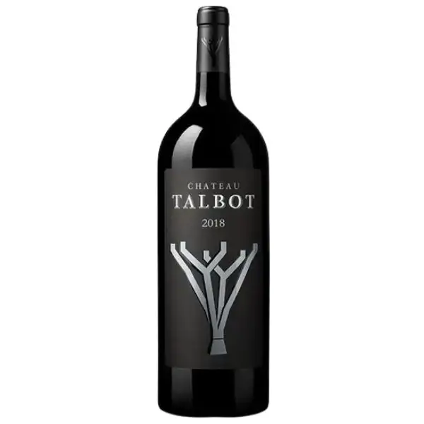
Reminds me of the new Talbot label. It’s like nobody really tried to translate the visual history.
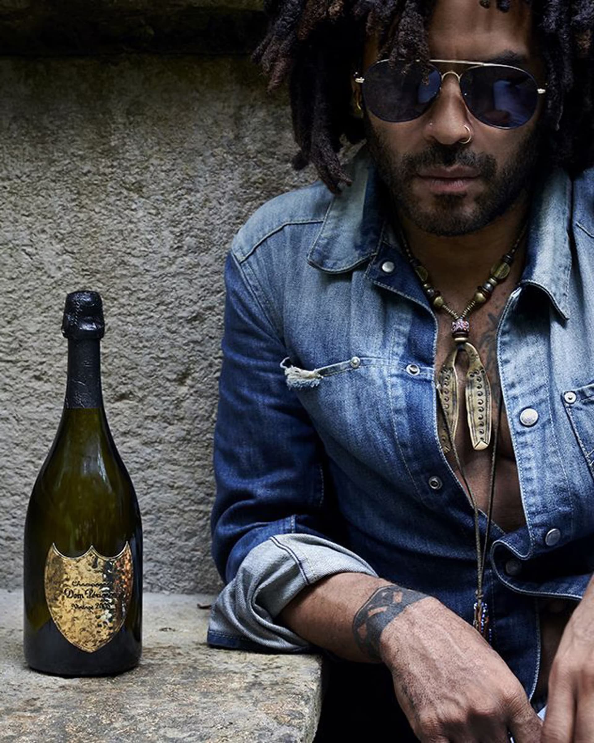
Dom Perignons artistic collaborations also seriously keep me from buying the stuff. Koons, Warhol, Kravitz and the estate of Basquiat. If it was collaborations with Arthur Russell, Aphex Twin or Roni Horn then it had some pull for me, not that it’d ever happen or should.
3 Likes
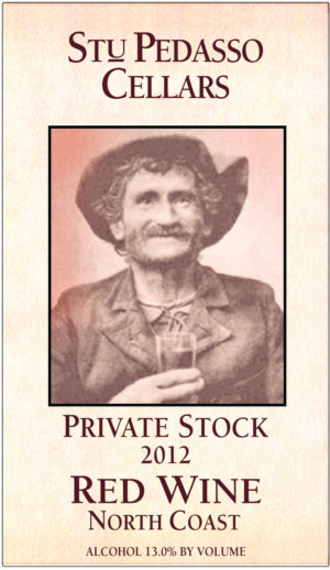
Mostly I kind of like the tongue in cheek “stoopid asshole” vibe.
2 Likes
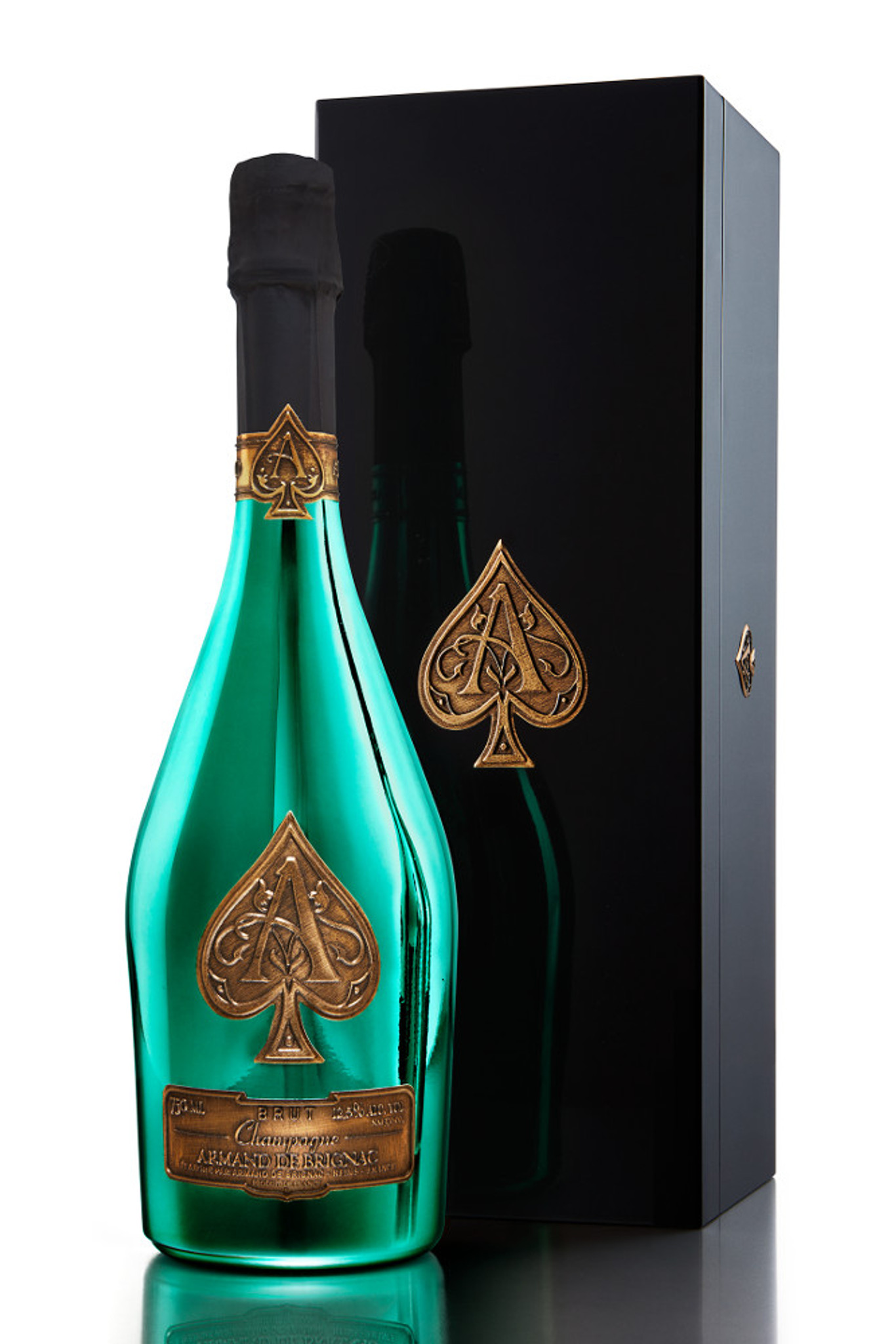
Pull this thing out at the VIP table in the club and you’re on top of the world. They know exactly how people use their product.
Is that a Menorah on the label? ![]()
1 Like
For me the winner. I would never ever buy a Sauternes looking like this.
sad (for me as I loved the old Rieussec label)
Brodie
1 Like
It might be!
1 Like
Must be friends with the Richards at Paloma.
(Although I kind of like theirs)
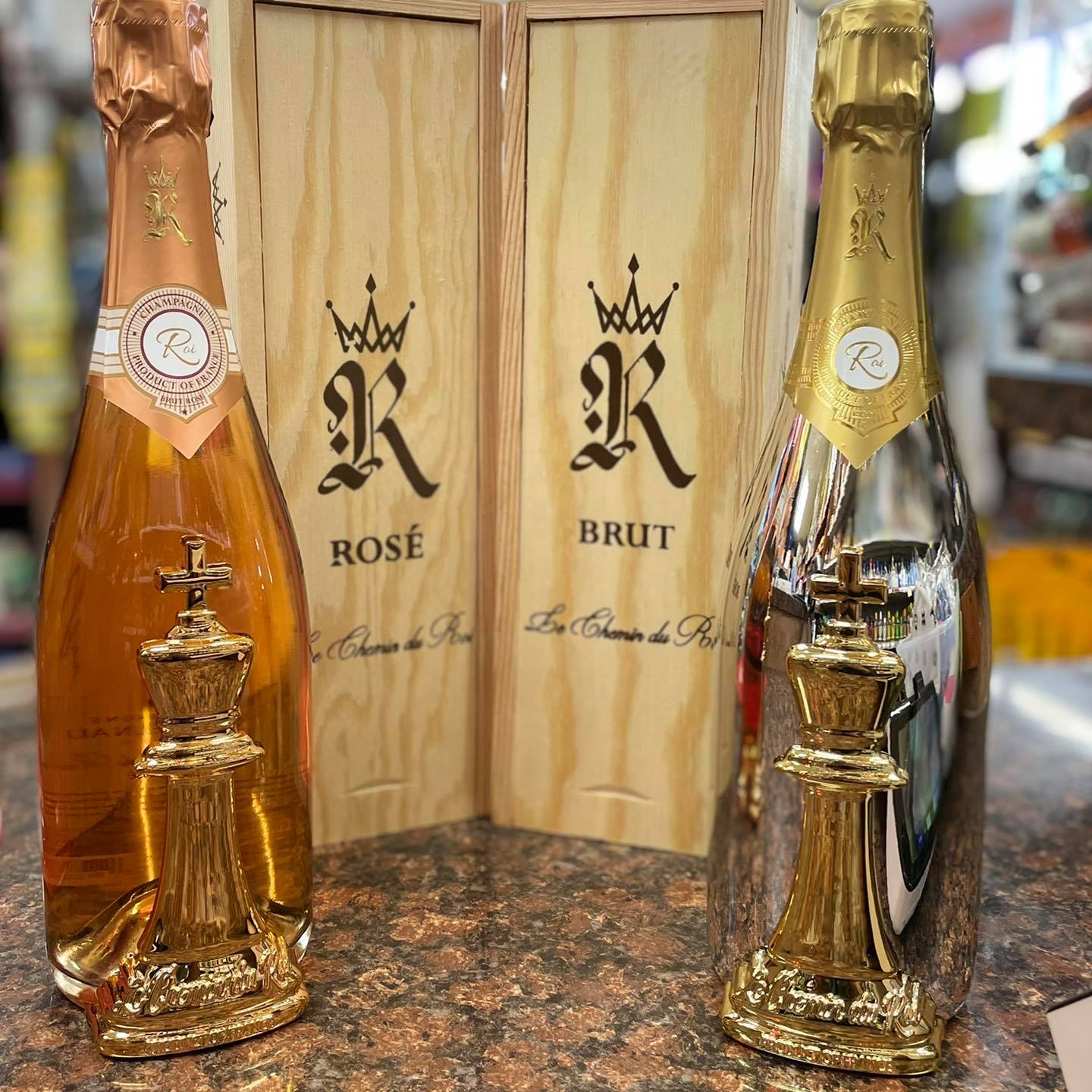
The reflective bottle is bad, but the huge plastic chess piece glued to the front? This feels like a parody of the ‘vip bottle’
2 Likes
A few years back, I heard an interview with Kermit Lynch.
The interviewer asked him what he DIDN’T like about French wine.
His answer:
“The labels. They are terrible.“
And he’s right.
I recently attended the grand tasting at the San Francisco La Paulee. Some of the best of Burgundy, all in one room. Any winery that had a label that was even remotely attractive was positively head-turning among the sea of staid, boring labels.
Completed in 2013, the Grand Chai immediately stands out among the most important wine-growing architectures of Bordeaux, particularly for its originality, whether in terms of its size or its aesthetics. Completely* unique in its design, and and thought out for optimal use by the teams, the new Talbot winery, born from the work of Bordeaux architects Nairac and Vacheyrout, has nothing comparable in the region.

1 Like
Rather bright for a cellar? I realise (assume / hope) no bottles in this area but still…
The new label makes a little more sense but it’s a bit inside baseball.
I still think the label is more Napa style than Bordeaux.
1 Like
The Laurent Ponsot label is what the Cyber Truck would be if it were a wine label.
5 Likes
That’s the barrel room.
It’s a work area.
You want it well-illuminated.