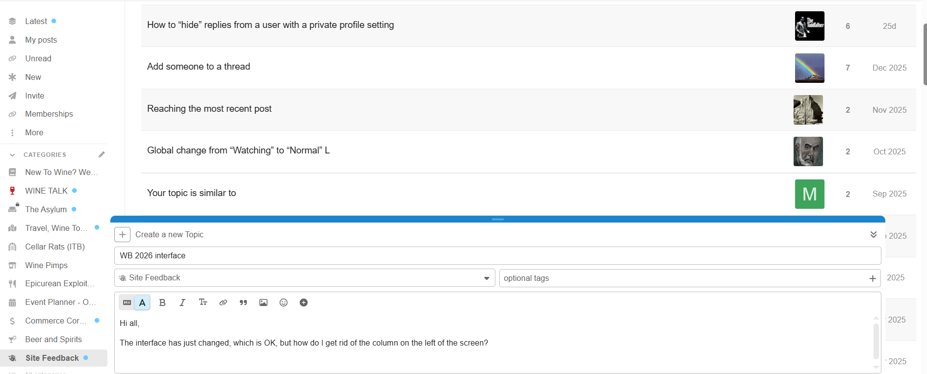
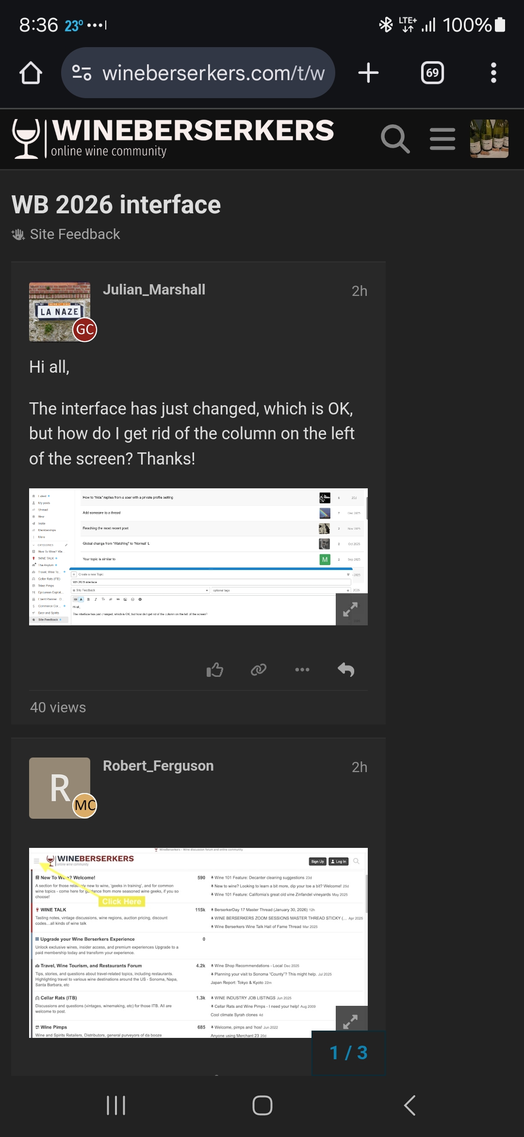
Hi all,
The interface has just changed, which is OK, but how do I get rid of the column on the left of the screen? Thanks!
Hi all,
The interface has just changed, which is OK, but how do I get rid of the column on the left of the screen? Thanks!
Perfect - thanks!
Can we shrink the size of the photos/avatars associated with the profiles ??
Mobile interface is way narrower now, only about half the width of my screen. Difficult to read threads.
Yeah it’s fine in the topic view but not in individual posts
It’s definitely a theme configuration issue.
I suspect there is already a thread but I can’’t seem to find it, which is part of the problem.
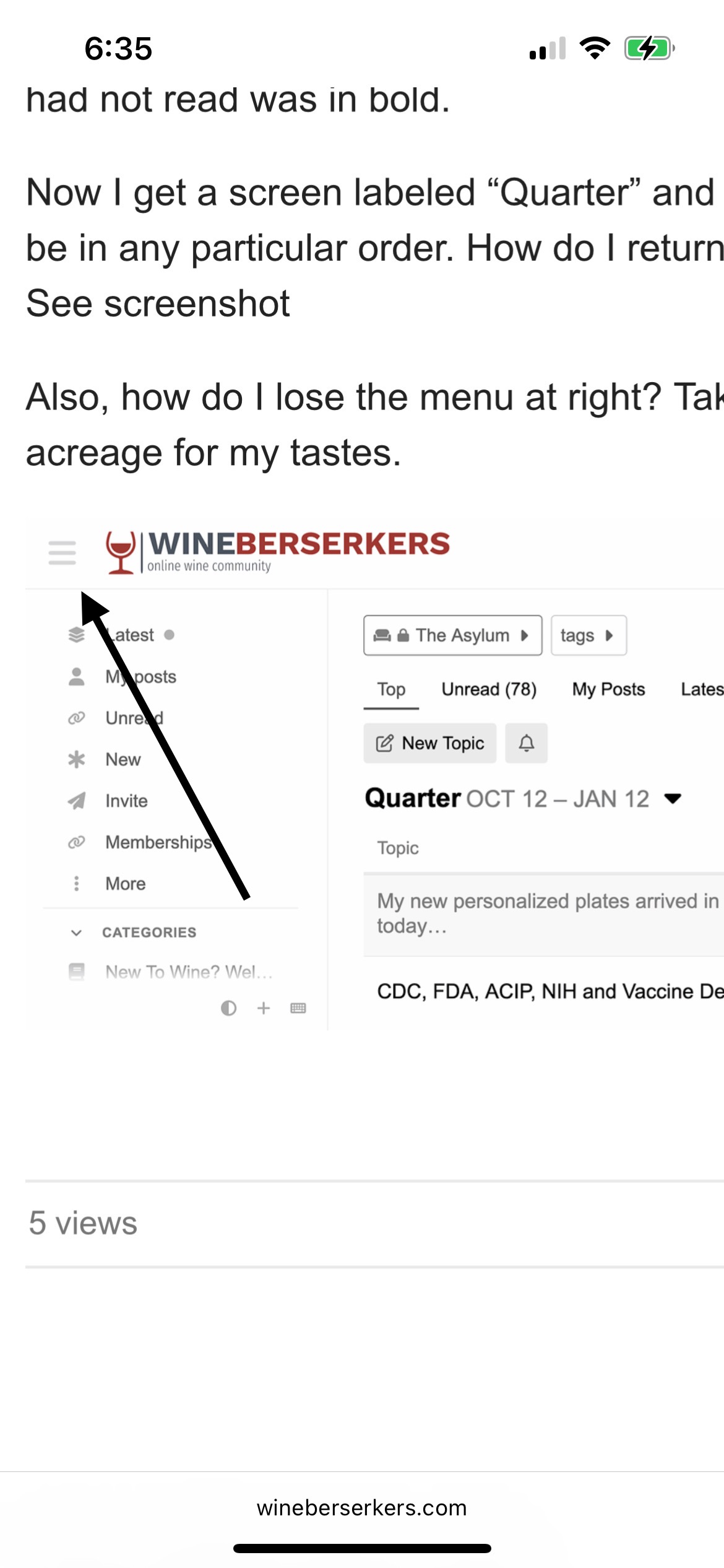
Previously I went to Asylum and it displayed an array of topics in order of the date of the last post. A thread with new posts I had not read was in bold.
Now I get a screen labeled “Quarter” and it does not appear to be in any particular order. How do I return to previous function? See screenshot
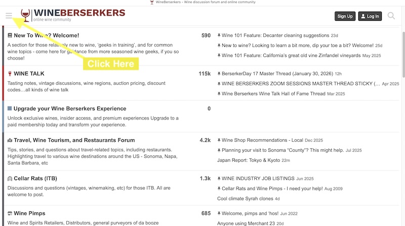
Also, how do I lose the menu at right? Takes up WAY too much acreage for my tastes.
Neal,
There is a WB 2026 thread in the Site Feeback forum.
Here’s the WB 2026 Interface thread:
So now the background is black with white letters, how do I change it back to normal?
Beautiful! Thanks Brian.
Now that I’ve go the threads back to full-screen, things seem pretty much back to normal. But if there is an adjustment to the bold typeface used to denote threads with new posts, I’d crank it up to extra MF’ing bold. The difference between bold and std seems to have diminished (although that may just be me).
In fact, in wine talk, there is no difference between the two at all.
Thx!
Thanks for the help posted here so far. Much appreciated!
When classic mode sirs?
One minor query:
In the prior version, the date of thread creation was included below the thread title. By clicking on the date, one would be taken to the top of the thread. With the date absent, one is taken to the bottom (most recent) post. To get to the top takes an additional step. Not a big deal, but I assume that updates are, in part, to eliminate unnecessary steps, rather than add to them.