Theme not browser - Discourse Default? WB Default? Get off My Lawn?
Which theme are you using?
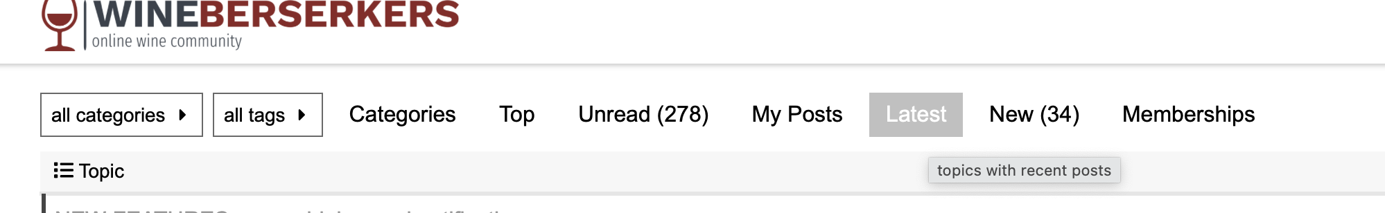
Are you in mobile or desktop? Where did you hit ‘Latest’ before that isn’t there now? I still see it on desktop
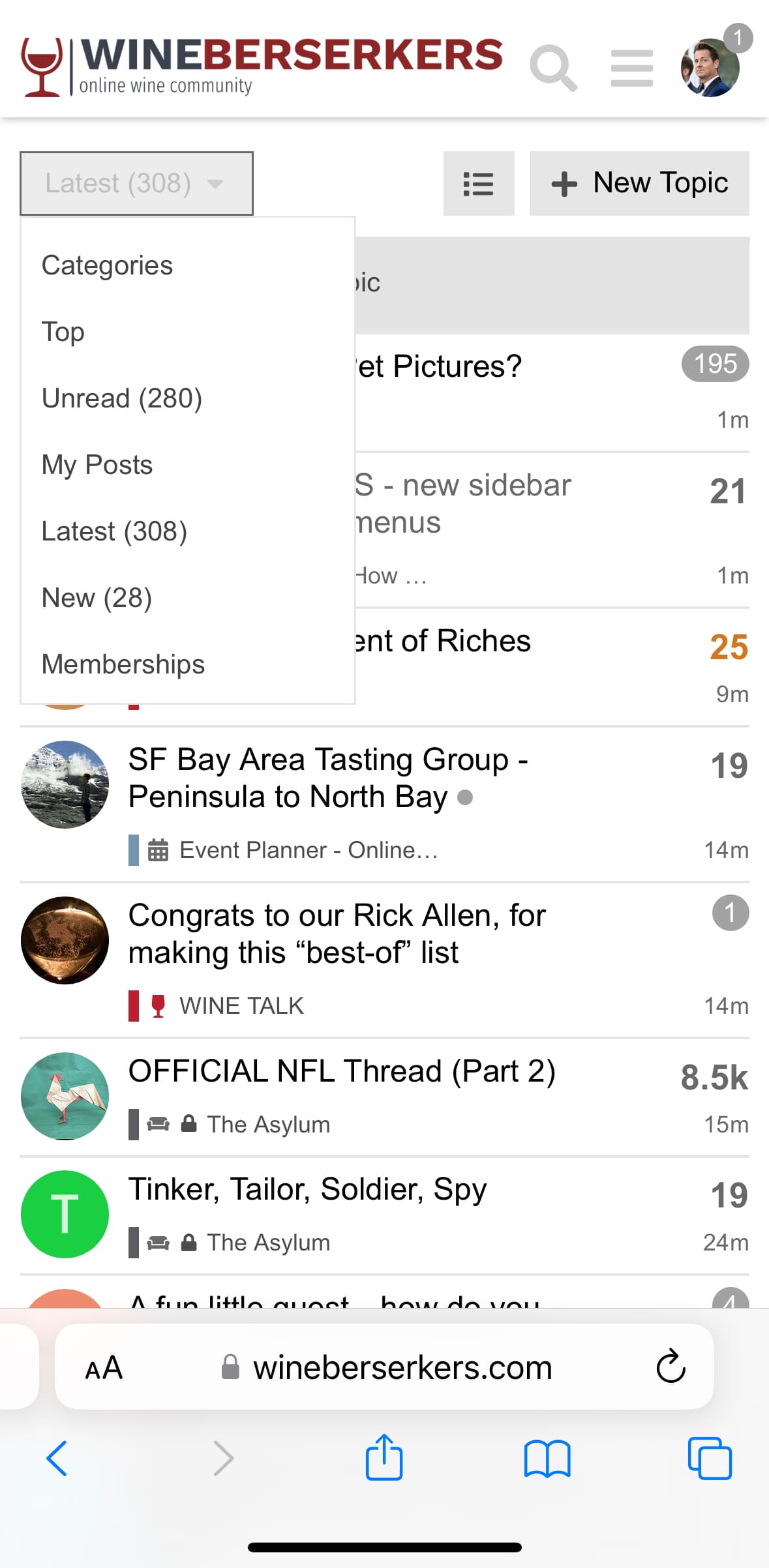
And on mobile
What ever happened to KISS???
2 Likes
Edge is a theme. It’s called “Edge of my lawn only!”
1 Like
Ah, the custom themes…still very likely that and Get Off My Lawn will be deleted, soon, as any updates to the system don’t transfer properly otherwise - they were meant as a ‘crutch’ to ease the transition, but they will have a shelf life and we’re getting toward the end of that
1 Like
I’m in WB Default on desktop and Theme default on mobile, sounded like the most likely to be well supported.
On mobile, my impression from past discussions is that some behaviors may depend on size of the display.
-Al
We’ll continue to work on it - I’m reviewing the dev sites now, can always remove it, but it seems like we all like the new notifications menu but not the sidebar, and I can’t seem to do just one, they are intertwined in some way, but I’ll dig into it and find out
So far, don’t see the advantages of the sidebar. At least it no longer displays the long list of badges that I’ve never really needed to see.
-Al
Agreed, I’m hoping to get the notifications functionality without the overly complicated sidebar, stand by…
@Al_Osterheld @Rajesh_P_a_r_i_k_h if you hit the 3 bars and click “everything” it auto defaults to latest.
1 Like
As far as I can tell, the behavior has changed throughout the day. But, I generally enter WB on unread rather than latest. I liked the old behavior, so far don’t see advantages to the new behavior and like it less. But, the layout/spacing changes on the mobile UI are more annoying.
-Al
i like it… makes it work closer to the old forum… ![]()
That’s terrible. Why alienate your user base just to male changes nobody is asking for?
If anyone lost sight of the (IMO very useful) Unread and New filters, they’re still available via the (3 horizontal line) menu, and clicking on all categories. For me that’s the easiest view for catching up since last visit. Not sure if others feel the same.
2 Likes
I start by looking at Unread, then switch to Latest. Don’t find New as useful since I think it’s new topics rather than new posts. So, for me, accessibility of Unread is key. The 3 horizontal bars used to include it, now does not.
-Al
2 Likes
+1 , and primarily use mobile.
The sidebar is largely redundant, as I get the same access to categories by clicking the wine glass at the upper left corner and access to messages via my account icon.
On mobile, I do not see Unread/New via the hamburger. I’ve invested time in setting up tracking/normal statuses for the posts I’m looking out, so it’s a pain not to see where I can jump directly into “unread” vs picking a random post, then scrolling down to the bottom, which has a list of suggested threads (unread + new)
Appreciate the input - trust me the sidebar is going away as soon as I can figure out how to keep the notifications functions and remove the sidebar
2 Likes
Appreciate the efforts to improve the functionality.
-Al
3 Likes
Another vote for keeping Unread back on the right. That was the first thing I noticed when I came to the site yesterday.
No votes needed - it will be gone as soon as I figure out how to keep notifications and remove the new navigation
2 Likes