I also like the upside-down rams in the 1989 George Baselitz. When I first saw it I thought of rams happily drunk on wine. But of course the symbolism was much deeper than my simplistic reaction - it was commentary on the world being upside down with the fall of the Berlin Wall.
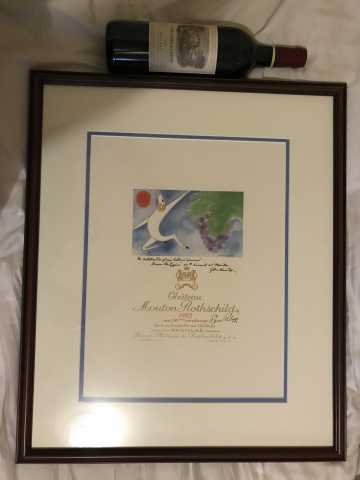
I love the 1982 label enough that I have a framed enlarged copy hanging on the wall. A friend picked the print up for me at the chateau around 1998 and I had it matted and framed. It is even more striking in a larger format. It just exudes celebratory joy to me and makes me happy each time I look at it.
Other favorites include the 1955 (Braque), 1958 (Dali), 1970 (Chagall), 1980 (Hartung), and 1986 (Sejourne, though this one may be because it is my favorite vintage).
You might check with the winery. I have a poster that I got at Mouton with all the labels, but they could make similar things for one label - don’t know.
Ugh, now I have to agree with Bobby. That’s a genuinely gorgeous piece and it works both on a wine bottle and as a piece of art.
I know a guy who is one of the foremost authorities on poster art in the world (I believe he has the single largest collection in the US)…will ask if he’s ever seen the Mouton label as a poster. My hunch is no…poster art was originally nothing more than a means to advertise in a time before mass media. Eventually, people became attracted to the (often) bright colors and sharp graphics and started collecting them. Methinks that Mouton would not have advertised their wine to the masses and that the art was created to be a label, so any larger sizes would be something produced by the winery and, almost certainly, less collectable. Anyhow, will update when I know more.
Confirmed — was not originally released as a poster.
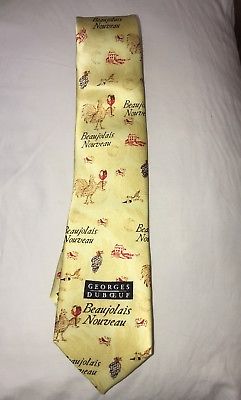
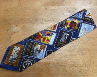
I know that the annual release of Beaujolais Nouveau from Georges DuBoeuf involves a commemorative necktie. Kenwood’s “Artist Series” also had a poster and tie available for a while. Would that fall under senseless acts of promotion?
Mouton does print enlarged versions of at least some labels. Here’s a picture of my print of the 1982 label with a 750ml bottle of 2000 Carruades des Lafite for scale (wrong Rothschild branch, I know).
It’s a beautiful print on heavy card stock and all of the gold printing is embossed.
Julia Santen is one of the country’s foremost experts in vintage poster art. She was not aware of the Carlu Mouton label being massed produced as poster art. Too bad.
He’s only got a fraction of his collection on the website; some very cool paintings too including an Emile Compard abstract paining of Josephine Baker that is simultaneously risqué and brilliant.
Wow, I wasn’t even aware of this, but I love the work of Gerhard Richter and of course Mouton is Mouton. Very cool. I’ll have to get me some. Obviously they have had an amazing series of artists make labels, but Richter is a very fine pick in my book