Also, count me among the group of everyone who hates the new interface. Browsing their website used to be quick and easy. Now, it takes me much longer to browse much less. No bueno.
2 Likes
As a point of interest, I emailed them again in late August with some additional detailed feedback (including a link to this thread) and did receive a response. They said that they appreciated the feedback and sent it (and the previous email) on to their IT and web development teams.
It would be nice if they’d take the notes to heart and fix some of the density issues, but there’s been no movement in that direction, as far as I can tell.
I’m trying to buy a few bottles currently, and the website appears to not be working correctly. I can’t advance past the cart to the checkout. Another feather in the cap for the IT team!

It’s better just to go down to the store. It’s like walking in a Zen garden.
New site sucks. Auction changes are almost as bad. With new site, you can’t search for old purchases via your Wine List and them use the date of purchase to find what you paid in the My Orders section. So no way of finding out what you paid for something that you bought on auction a few years ago.
Auction email close messages don’t show final price. So you have to dig further to find final price.
And this last complaint is not related to the new site, but I bought a Pre-Arrival a few days ago only to be notified today that they made a mistake in the listing and won’t sell me the wine for the price listed. So I am taking the refund that they offered.
The RWC store used to be one of my favorite weekly stops. Bummed about the loss.
1 Like
What? Is the store closing?
No, the overall experience with them has changed though.
We can be critical of their website, but overall it’s still decent, the selection is still good, the auctions are good, the policy of being able to buy from inventories in different stores and have it transferred locally, etc., it’s all good. I’m sure they either felt a need, or the old software required a refactor. We all seem to think it could have been done better, but regardless, it’s still a great store to have imo.
1 Like
Let’s not forget that auction commissions used to be 5%. They can run their business however they want and it will still be better than Total Wine, etc. I will just continue to visit them less.
I agree with this, Alan, but I’m sad that almost the whole internet experience is now - at its very best - “Thank god this site is only slightly less good than it used to be.”
1 Like
Hey folks - I started working for K&L at the beginning of the year. This is my first time seeing this thread so my apologies for being a bit behind the 8-ball, but I’m bummed to see that some folks here haven’t loved some of the UI changes we’ve been making to the website! Our goal has been to add a touch of modernity to it (web pages that have dynamic scaling for different sized monitors and don’t look straight out of 20005, better filtering, though we may be wide of the mark here it seems, improved visibility of what’s available for each product on our product landing pages, and many other things that our team could summarize far better than I). I think it’s safe to say a few of you don’t love the changes!
Below are some bullets on the main issues you folks have raised. Let me know if I’m missing anything core. I meet regularly with our IT team leaders and would be happy to flag them and see if we can address them. I can’t promise anything, but want you folks to know we are listening!
-
The new layout is far less dense: bigger fonts, more white space and only 12 items per page, so browsing takes much longer and a compact view is missing.
-
Key information is harder to reach: stock isn’t shown on product pages - this might have been a brief bug, as it should show! If anyone is having issues seeing them please let me know.
-
Purchase and auction history is harder to use: you can’t easily find what you paid for past buys, and auction close emails don’t show the final price.
-
Reliability problems: connectivity errors and at least one checkout failure.
Thanks for the feedback!
Tom
5 Likes
Thanks for checking in, @TomZacharia . Those items have all been mentioned. To add some information on the first one (which is my personal top point of feedback):
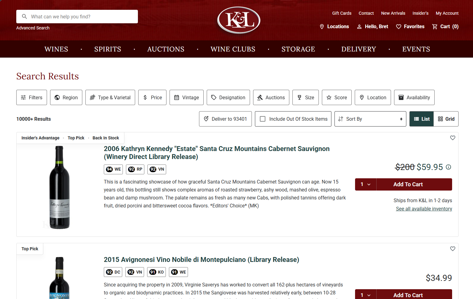
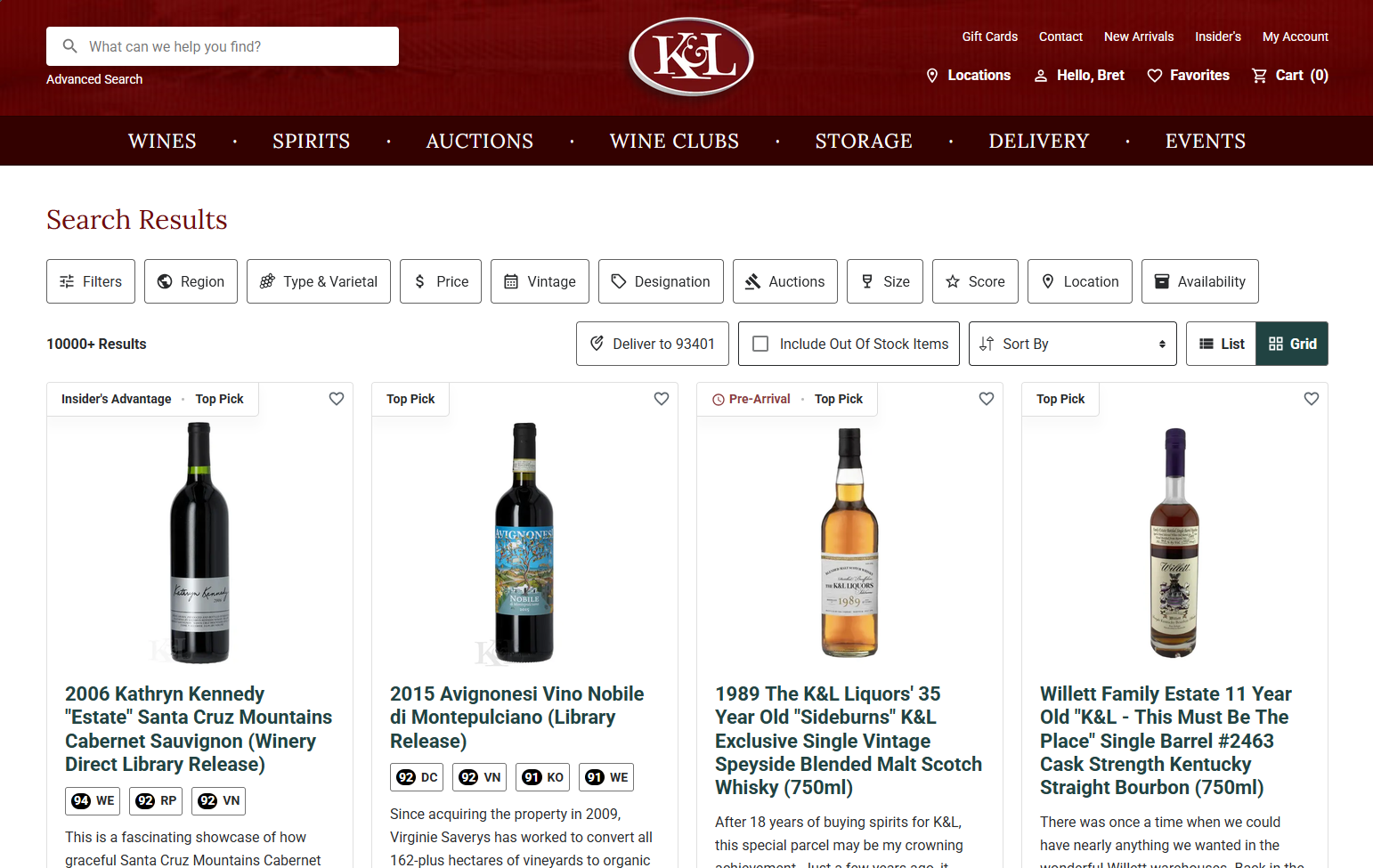
12 items on a page, visible at the same time, would be a fantastic improvement. I just opened up a page on my desktop at work, and depending on whether I choose “List” (which I always will) or “Grid,” this is how much I can see on my screen at one time…either one and a half items, or two-thirds of four items:
Not to be cynical but it’s hard to think that anyone associated with Zachys can help on the K&L web site….
Nice to know that you all are checking in and considering the feedback.
2 Likes
I’ve bumped into Tom a couple times now in NYC haven’t seen any horns.
Though, I heard they made him the Burgundy buyer now so who knows what will happen with the nefarious influence of that dastardly region.
1 Like
Great to hear you’re open to feedback, Tom.
I think the big thing to clarify is that UI (User Interface is how it looks) is very than different than UX (User Experience is how the user interacts with the content). The old K&L had pretty horrible UI, but the UX was phenomenal as the previous comments have said. Having come from a web design background, I see a lot of redesigns conflate the two and end up making something worse like what’s happened here.
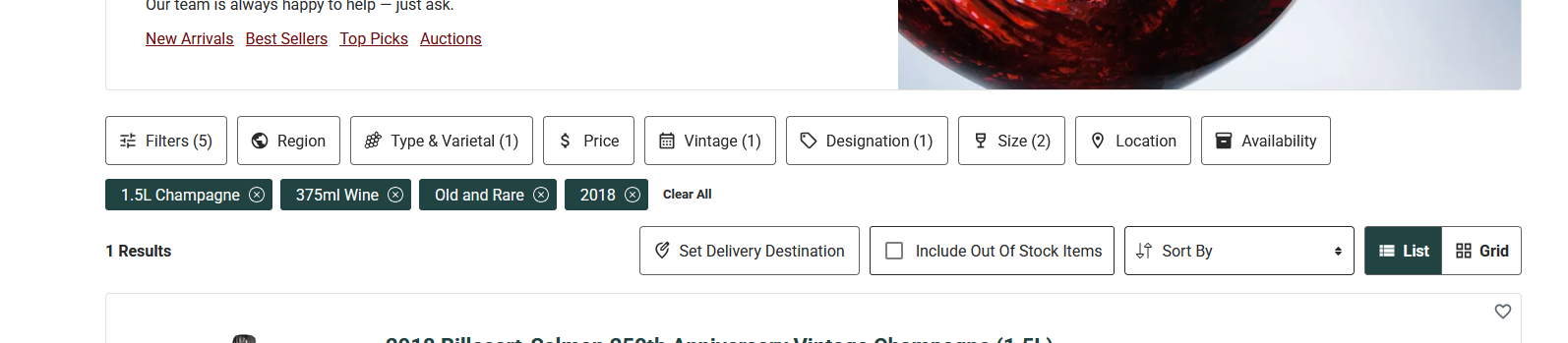
With the new site, for example, the filtering tools are in an expandable sidebar, but there’s also a row of buttons that serve no function other than just expanding the sidebar which makes this layout pretty messy. Then you get the sub-row with all of the filters you selected, but those are just scattered under the buttons. It makes the UX really clunky for trying to parse the items you’re looking for and then adjusting filters. The old site had a fixed sidebar that was extremely easy to use.
Just my two cents for you to share with the tech team. I think these are all pretty fixable changes!
1 Like