One of my favorite wines despite a terrible label - Collier “Charpenterie” Saumur. Comic Sans font!
Guess this falls under the Good Wine, Great Label category. The Chappellet Malbec Magnums are even more impressive
Wrong - this is classy and very distinctive (and uniform for the whole line-up).
There are much worse designs:


Actually, I quite like the Anne Gros label. Nay on the Dufoulueur though.
Any of the Jean Raphet picture labels. Horrid!
the text registration on “Grand” looks off on the Anne Gros label maybe they meant to add Cru. For that bottle cost I would hope the could center justify
Dirty and Rowdy are pretty fugly. Love the wine tho.
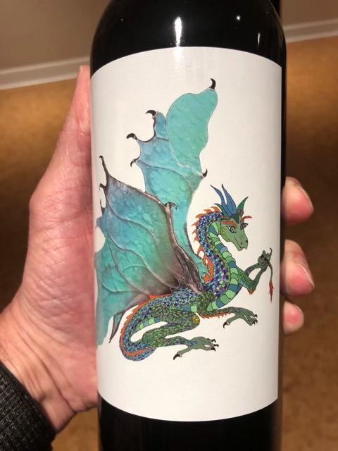
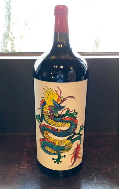
That is a cool label. I must have something for dragons.
Bad kearning?
I’m usually a traditionalist but I love the D&R labels.
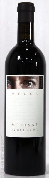
Not sure if it’s a great wine, but it’s an expensive high quality wine. And the label looks like some peeping Tom or Big Brother is watching you.
Kearning is the spacing between the letters. That label just looks like they forgot the word Cru to go after Grand
that just looks like a bad photoshop mock up…looks correct here:

Here’s one of the magnums. From what I remember from our visit one of the daughters is an artist or graphic designer and designs these labels.
We bought one for our daughter for when she turns 21.
![]() Best labels in the industry IMO.
Best labels in the industry IMO.
The 2nd word “CRU” is missing on this pic - no idea why (I took it from the web without noticing, sorry) - on the bottles it´s correct.
Haven’t paid the WB membership fee?
Good point about Bucklin. I had not seen the new labels. Very nice. But I prefer the old labels.
Phil Jones
I agree, love the simplicity of the Jadot Musigny label.