Good list. I forgot about Willi Schaefer. Love those. In fact a lot of the Germans are good (Prum, Von Schubert, Egon Muller …) Lafarge great call too.
Thanks. Yeah, I agree on the other German labels too.
Under nonfugly, besides being good wine, I think this is a beautiful label; the gold highlight on the map shows the vineyard location for this particular wine (note also the coordinates above):

The Lewis label is fugly.
https://cdn.ct-static.com/labels/1392753.jpg
But I think that the Schrader Old Sparky is cool
https://cdn1.wine-searcher.net/images/labels/50/76/schrader-cellars-old-sparky-beckstoffer-to-kalon-vineyard-cabernet-sauvignon-napa-valley-usa-10435076.jpg
Hard to get much worse than Myriad.
Hate the Rhys labels, but more because it’s difficult to read the designation.
I think what’s on the outside is not as important as what’s on the inside.
And I don’t want to have to pay more money to offset the cost of the label.
A label probably does matter in a retail environment where multiple bottles of similar wines are all fighting to say “pick me”.
Agree that Lewis is ugly.
Beauty is in the eye of the beholder. Some like elaborate, artistic labels, and some like minimalist or traditional labels. There will be no consensus.
My two favorite labels are Ridge and Bucklin.
Phil Jones
is there a worse label than Cayuse Bionic Frog?? The wine is great, but the label is no bueno. If I knew how to post a pic I would.
yeah, anyone able to provide a quick primer on how to include a pic (vs a link)?
Two solid choices Phil!
Do you dig the new Bucklin labels (just changed with the recent release) or are you referring to the old ones? I’ll probably get used to them…but right now I’ve gotta go with the old.
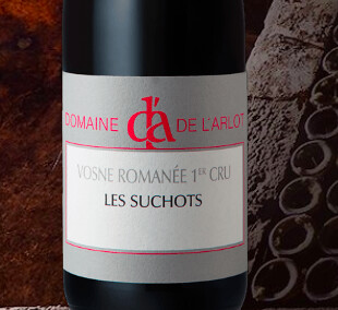
L’Arlot great wines ugly label
A. Rafanelli, looks like something off a mid-60s italian restaurant menu
Love these labels from MM.
Count me as another who loves the iconoclastic Ridge label. Agree with Bueker there will never be consensus on any of this.
One wine I love that has a label I’ve always had trouble with is Roilette:

That yellow/red color scheme is a turn-off. I’m also not a big fan of the R-M Napa Cab label:

SVDs and Pinot labels are okay, but that silver thing is just ugly…imho, they should have kept the pre-2008 label. Love the wine though!
I totally disagree! ![]()
I’m only allowed to argue with you if you pay.
Caterwaul
No Girls. All of them.
Do these people design their own labels without any input from professionals?