I am constantly hitting the like button when scrolling on mobile when I don’t intend to because it is located right where I swipe up with my thumb. Is there a theme where it’s moved to the left side? Thanks.
It’s been discussed before, and not really, as 1) it’s limited space to work with, 2) we have multiple themes so members can select their own, meaning each of them would have to be customized, and 3) all depends on how the user holds and scrolls, as, for example, I’ve never accidentally liked a post on mobile. Some do, most don’t - there’s no ‘perfect’ spot really, unfortunately
I thought maybe themes had more flexibility in terms of where stuff shows up. Not so?
No, each would require custom coding, and also there’s no way to know how many are using what theme and color combo, plus there’s the added situation with size, as individuals can zoom in as well, which affects placement further
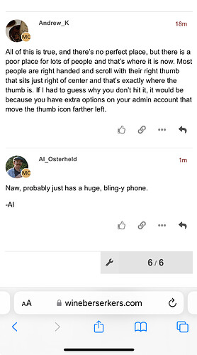
All of this is true, and there’s no perfect place, but there is a poor place for lots of people and that’s where it is now. Most people are right handed and scroll with their right thumb that sits just right of center and that’s exactly where the thumb is. If I had to guess why you don’t hit it, it would be because you have extra options on your admin account that move the thumb icon farther left.
Naw, probably just has a huge, bling-y phone.
-Al
I don’t have a different format than everybody else, nor do I have options to move the like button, it’s the same as what everybody else has, who chooses the same default theme
Also, I’m right handed, but scroll with left most of the time, or a finger rather than thumb
i’ve tried mightily to recreate this problem and it’s really “just don’t do it that way”
while it’s true that the “like” is horizontally where a right-handed human would place their scrolling thumb, vertically there’s veritable infinite other space on the screen to scroll.
edit: wow even todd doesn’t use dark mode. am i the only one?
Not surprised given the demographic around here. Old people are stuck on light mode because it’s all they knew growing up. It took me years to go to the dark side and I’m not that old and in the tech space which is typically more forward thinking.
super interesting response on a few levels (dark = forward thinking??). i wonder how old i come across online. i’ve never pondered that.
No, just need to be open to change.
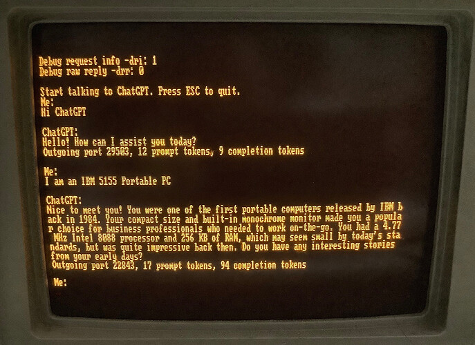
Meh, command line is command line and is still dark mode today. Start with Apple II or Windows 3.0 and see where you get.
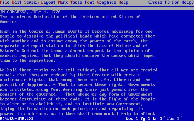
WordPerfect… not command line. Just old…

That’s still DOS aka command line.
No, command line is terminal mode. This is an old time application
It’s light text on dark, which you claimed is too newfangled for us old guys.
Meh, it’s still DOS. I had a basketball game on DOS. Was it command line technically, no, but there was still no UI. I’m talking about original experience with UI and what feels comfortable. And it wasn’t meant to be an indictment on anyone, just an observation of human nature.
In typical WB style, this thread has gone completely off track. LOL!

