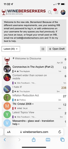
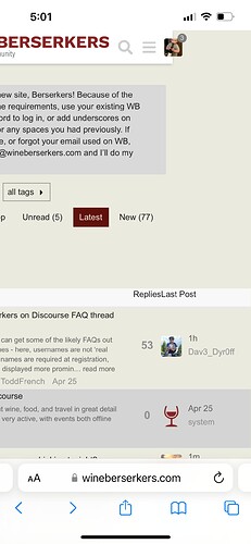
This isn’t a huge deal, but kind of annoying. The width of the content on the main index page is slightly wider than the screen on iPhone, so it can move side-to-side if you don’t scroll perfectly vertically. Makes it feel a bit janky. Here’s a video demonstrating what I mean (obviously I’ve exaggerated the side-to-side movement here to demonstrate it, but in normal scrolling it’s noticeable and really makes the site not feel mobile-optimized).
hmm. I wonder if the header logo is what is forcing extra width…
Could be. You can also see the numbers on the right are falling off the edge of the grey background on some rows. This is an iPhone 13 Pro (non-Max) FWIW; haven’t tried it on any other mobile devices.
Same on iPhone X
easy to adjust - what width should I give it and re-upload?
Requirements state this:
The logo used on mobile version of your site. Use a wide rectangular image with a height of 120 and an aspect ratio greater than 3:1
Currently each (regular and ‘dark’) are set to 976 x 120 width x height - had height at 123 before so perhaps that adjustment might have helped a bit?
I have been switching between the various themes to see which one I prefer. This is worse on the default than the get off my lawn theme.
90+% of my time on WB is on an iPhone with 9.9% iPad and a rare visit to my laptop.
I don’t know what causes this. It happens sporadically for me but otherwise it doesn’t. But a simple refresh seems to fix it. It’s as if the page loses its borders
Yeah, it looks better to me now (though if @CFu is correct and it’s intermittent, it’s impossible to say if it’s really fixed or just not happening right now…).
Right, but I made the change just a while ago, so please ping me if it happens again
Content width on this part of the forum seems too wide now. Pushed out by the width of the drop-down menu?
Can confirm. Same issue here after banner change.
NeverMind. Back to normal after moving to a new page
Regardless, I’m checking with the developers, see if there is a fix, has to be since Discourse is very much mobile-driven
I am seeing the same things. The thread counts being on the edge isn’t the end of the world. But, the reply box being off seems wonky.
I made a change that might fix it. LMK if anyone sees it fixed or not.
@ToddFrench saw the problem again. I just made more changes. Hoping once again it might be fixed.
Left hand side…
Scroll right…
It doesn’t fit. iPhone 12.
Also when you are typing a reply the keyboard covers up the window so you cannot see typos. That’s real fun when you fu¢k up as much as I do.
Wxample:
At least you care about typos. I use landscape orientation on an iPhone


