I think these two lead all other entries by a country mile; they look like they should be made out of velvet. What are they, and are the wines any good?
This one is scary.
They are Blankiet Prince of Hearts Proprietary Red and Blankiet Rosé. The wines are pretty good, but absolutely have to be served from a decanter!

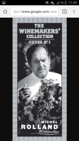
That is scary. He looks like a mafia don preparing to murder a vine.
I totally agree on this one. He’s a terrific winemaker, but I don’t buy that wine because I don’t need that label staring at me while I eat dinner.
My late friend Milan Maximovich had a label for Thunder Mountain Winery that was, uh, rather distinctive…

Bruce
How am I the first to mention ace of spades?
Why, Corliss, why?!?

I assume it’s decent juice but I will never know because even thinking about the label gives me the creeps.
We need a three wolf moon wine.
That label is great!
I didn’t understand the martian name or the illustration. Maybe you can explain.
Winner.
Shafer’s labels and Pégau’s Cuvée da Capo label have to be contenders. I also dislike the label for Dominque Lafon’s new brand under his own name (obviously not the Comtes Lafon label which is one of the great classics). Perhaps the winner has to be the new label of the Phelps Insignia, which evokes the wallpaper of a Viennese bordello and complements the squat, flagon-like bottle to ghastly effect.
Along with the change to Chevillon’s label I’d point to Antoine Jobard’s new labels as an unfortunate departure from the very classic goblet label that his father used.
My wife detests gold on labels and so hates the old Coche Corton-Charlemagne label with a surprising passion.
This one raised a stink
She must love 2012 Angelus and 2000 Mouton as well. Tacky and Trumpian.
The new Pavelot labels look very 80s.

I can practically hear the techno music from here…
You beat me too it, not only the worst, but the scariest. Makes me think if I see him standing near a playground, I should call the cops, it’s that creepy. I once put tape on the label.
The Thunder Mountain is actually funny. I was a big He-Man fan as a kid though, so the label is nostalgic for me if nothing else.
Sorta looks like Bill Belichick.
The story I heard was that the man on the label was supposed to be his alter ego. Frankly, I find the label so spectacularly bizarre, that it’s brilliant.