Hey Berserkers! For the last 18 months I have been building a wine platform that has a large amount of data on ~55,000 wines including metadata, descriptions on thousands of wines/producers, critic scores, and live pricing from a network of retailers. I am now building the front end that will organize this data to help users better discover and find wines they like.
With that in mind, I’ve come up with a set of analytics for every wine that has 5 metrics in a radar chart so they can easily be visualized among wines. It’s a rough draft and I would be very grateful if you guys have any thoughts or feedback on this initial set of metrics.
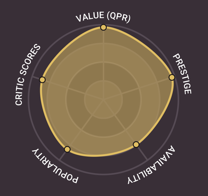
Value - This starts as a basic QPR that compares price to average critic score, but then ranks the wine against a blend of all wines and (if enough data) its regional peers to give a percentile rating. So a high “value” Beaujolais will have better QPR than other Beaujolais.
Popularity - Over time, this will be a ranking of relative interest (page views, engagement, searches) for the wine on my website. But since it’s so new and I don’t have that data, I’m currently using a proxy based on a variety of factors that simulate popularity.
Prestige - This is a producer-level metric that applies to all the wines they make. It’s weighted blend of critic reviews across their portfolio, review coverage (total number of reviews compared against all other producers), rating consistency across all wines (std dev among ratings), and popularity within my database. This rating is then normalized 0-1 across all producers that have enough data points to generate a ranking. Ultimately asking - how well-known, durable, and consistent has this producer been over time?
Availability - I’m ingesting inventory / price data from a number of retailers in my network and based on that, wines with more available offers get a higher score.
Critic Scores - Simply the normalized, average scores for this wine among all critics across all vintages where an average of 75 points would get a 0, a wine with an average of 98 points would get a 1.
A few notes…
-
In my testing, this has been a great starting point. It’s really fun, for example, to use this for “Similar Wines” because it surfaces wines not just in the same style or price range, but also with the same “shape” that makes it far more useful.
-
All things being equal, it seems that a more “full” chart represents a “better” wine but this isn’t really designed to be a judgement on good or bad, more of a tool for comparison. For example, high availability may signal that you can easily buy more if you like it, while low availability may indicate something scarce and worth collecting, it depends on what you want.
-
I don’t think any of these metrics mean anything on their own. With a field like wine that has an overwhelming amount of data, this is just an attempt to create a standardized way to search / compare / discover new things.
I’m curious what you guys think of this methodology? Are these the best metrics on which to compare wines? Do any seem not very useful? What factors am I missing? I can think of no group of people whose thoughts on this topic I’d be more interested in hearing, so thank you for your help!
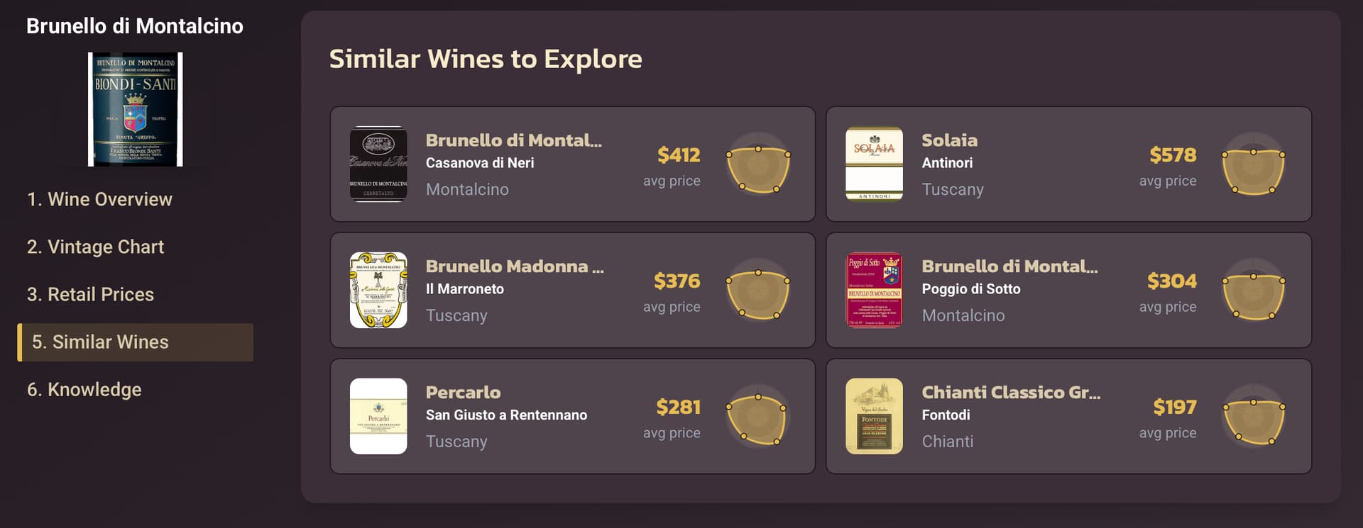
note the “flat top” (high in all metrics except value) shared among Biondi-Santi’s similar wines…