After seeing the Lewis cab get wine of the year and drinking a pride mountain petite (hot pink label) last week it got me thinking what unattractive labels they have. What is the worst label you have seen with quality wine?
The label was atrocious, but the wine was actually quite good.
I was gonna say SQN but then I read “quality wine”
To actually answer OP, I think the new Chevillon labels are terrible. They tried to modernize what didn’t need modernizing.
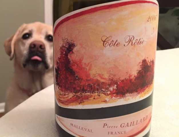
Looks like Fido wants some as well!
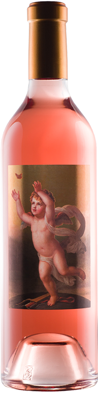
Orin Swift labels, hideous. But A So rules applies.
This
I´m the last who buys a wine due to the (pretty) label - and also I´d never refuse a fine wine, only because the label is ugly …
However - there are some really awful creations (but I agree: taste differs …)
E.g. one of the ugliest Burgundy label is “Domaine l´Arlot” - the pink-grey colours are a nightmare …
Bordeaux: really bad is SOUTARD (may it be the old “brown” one - or the newer blue one …).
Château Bouscaut is not much better (old AND new)
In Chateauneuf-du-Pape I really hate Clos de L´Oratoire …
I also regret that Jamet has changed his old (silver) label - the actual yellow one (looks like chicken shit) is definitely worse …
Photos, please everybody! Discussing bad visuals without the visuals is kind of silly.
I hadn’t seen the new Chevillon labels. Generally, labels for serious French wines tend to be very traditional, and when they do try to upgrade them, they do a bad job. They’re either only marginally updated, or they’re boring or both.

Really? I’ve always found that among the few old-fashioned French labels that actually had visual merit.

Simply ask uncle G O O G L E ![]()
The new Chevillon label is definitely a downstep, but it´s not “ugly” … only boring …
Thanks.
First, there’s the the randomly red “I” in Domaine Chevillon. Then, how many fonts can you count? At least the kerning is alright.
THIS
is a traditional old-fashioned label with merit ![]()
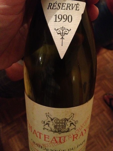
As old-fashioned labels go, the Rayas is fairly good – at least it’s not cluttered. But the Oratoire is a lovely piece of art nouveau, I think.
Can I assume you don’t like the Maximum Grunhaus labels?

Or Burlotto:

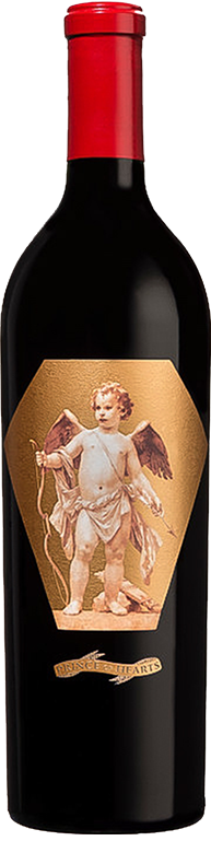
I imagine this one for a wine named “The Martian” in Spanish might be controversial. The wine is quite good, incidently:

The new Julien Pineau wines. The print is so small and faint you have no idea what’s in the bottle.
Alfredo is a friend and I may be biased, but having visited the vineyards that go into that wine, I’m in complete agreement on the quality of El Marciano.
Always felt those labels were also pitch perfect in relation to his personality.
I don’t like Bouchard’s label. Loring’s label is ugly too.
My favorite labels are Rousseau (all time great), Mugneret-Gibourg and Fleur Petrus (I don’t know, I just like it) and J. J. Prum.
and
I’ve never liked this label
John,
I guess I´m very sensible against inharmoniously designed colours - that´s what often offends me … (not only but also …) - e.g. the L´Oratoire
While not enthusiastic, I´ve nothing against Grünhaus … just very old-fashioned … and the Burlotto is also ok …
We are curiously awaiting YOUR suggestion for a substitute … ! ![]()