very cool!
Hey, I wasnt judging! If anything, i was super impressed. I was just drinking whatever we could steal from our parents liquor cabinets at that age ![]()
The topic is Beautiful not necessarily Functional. Unless of course you see Beauty in function.
For me, the Rousseau Chambertin label is the most beautiful - followed by the old von Schubert (Maximin Grunhauser) labels.
That said, I would also give credit to Domaine de la Romanee Conti for the most powerful statement and probably- from a marketing perspective- the finest labels ever. Years ago, long before I knew a thing about burgundy or had even heard of DRC, I still remember the first time I saw that label in a wine case. Even before looking at the price, I just instinctively knew I was looking at something very, very special.
When I created Norlin (my company that does luxury accessories including ostrich wine bags), I spent 2 days picking out the font and font size for our name. The DRC label is so very simple in many ways- but I know from experience it takes some serious work to get such a simple design to convey so much meaning.
Hard to compete with these classics as well…

Harlan
Rousseau Chambertin
Petrus
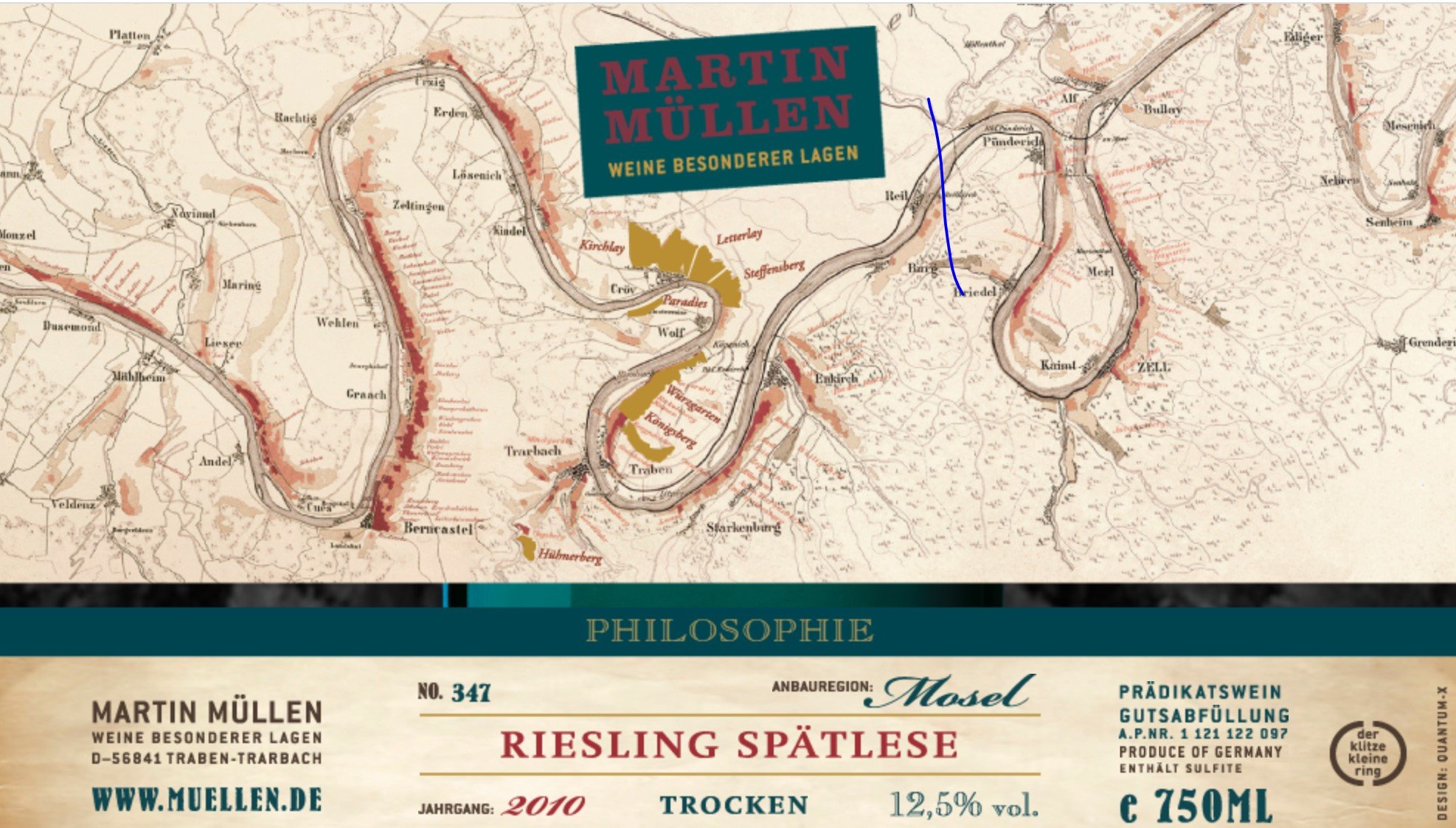
I love Martin Muellen’s recent labels based on an inset of the 1868 Trier district tax map. I grabbed this from his website, so there is a band showing part of the website and the word “Philosophie” that would normally be brown bottle.
Arrgghhh,
I don’t post on wines I import, but this is not a tasting note.
This is certainly not the most beautiful label, but I think it’s lovely. It was used by the grower from the late 1800s until the 1950s. They showed it to me on one of my first visits in the early '80s and I asked them to resurrect it. The original text is gone on the current label, replaced by legal bumf. But I’ll post the label, with the original text (translated into English) underneath.
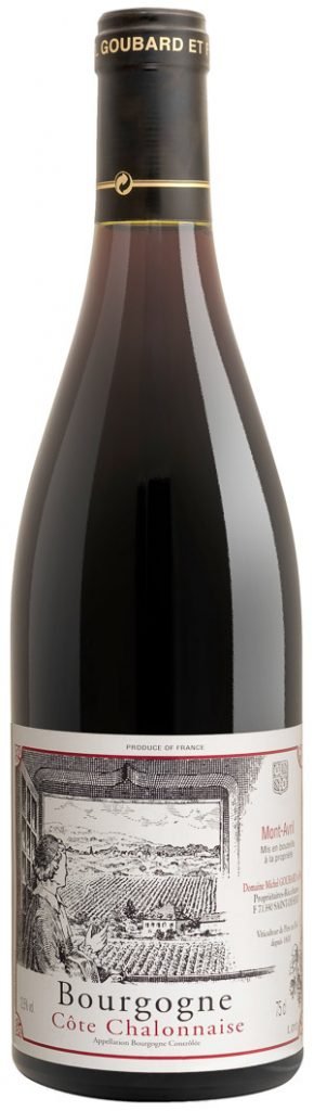
“From the chancery, I discovered the slopes and the vineyard of Montavril, where the wine is renowned”.
Abbe de Courtpee, 1715
Dan Kravitz
Beat me to it!
I’d add
Lopez de Heredia for its classical aesthetic
Gut Oggau for its modern panache
La Turque for its kaleidoscopic palate
Rousseau Chambertin for its prominence
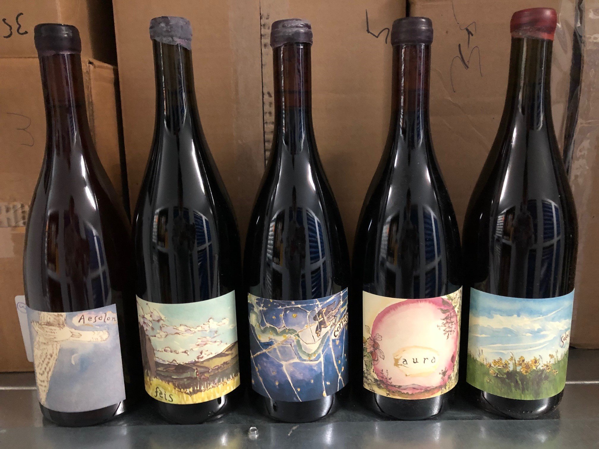
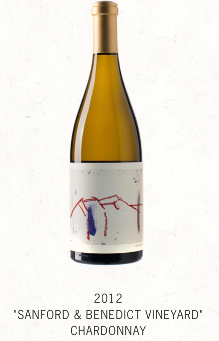
I’d put in a vote for Chanin. He paints the artwork himself.


ps. Sorry for super large size; not sure how to resize these
That’s really nice. Very classy.
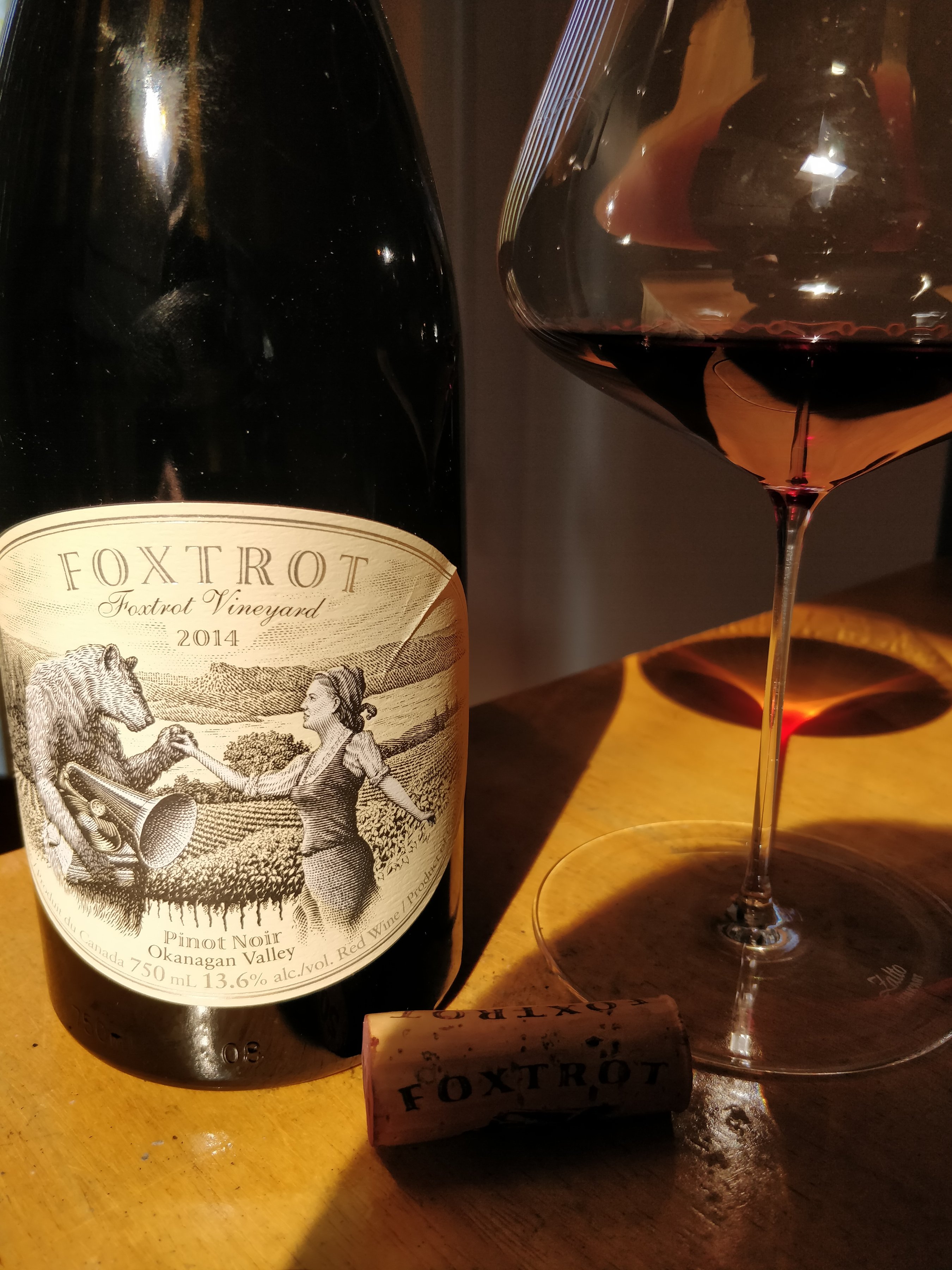
Foxtrot Vineyard Estate Pinot Noir from Okanagan, BC, Canada
No. It’s like Versailles. Decorating your McMansion like Versailles is gaudy. But Versailles is allowed to be Versailles.
Anyway, my vote goes to Lafite.
I maintain that Rousseau Chambertin is a label only Donald Trump could love.
![[smileyvault-ban.gif]](/uploads/db3686/original/2X/4/426cc97ad8dd530c8304b0918ca75ff841d4d950.gif "[smileyvault-ban.gif]")
Yes. The flip side of your point is why I love the label for Lapierre’s Raisins Galois so much. It’s perfect for what’s in the bottle.
Was about to put in a vote for Chanin. I’m partial to the landscape labels (eg the two you posted), but the actual art ones are pretty unique.
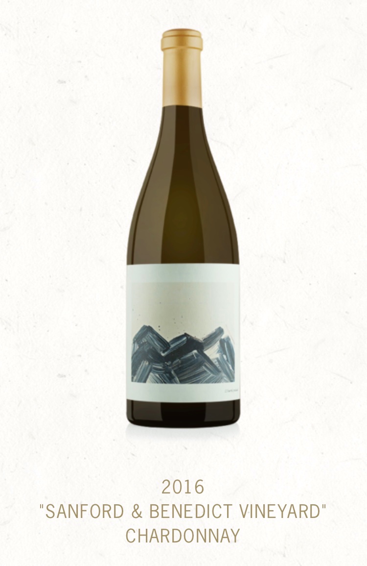
His new one for the 18 Bien Nacido is very pretty imo. I havent seen pics of it on the actual bottles tho.