And it can be yours for less than 1% of the cost of Rousseau!
d’Angerville - can’t really think of another one like it.

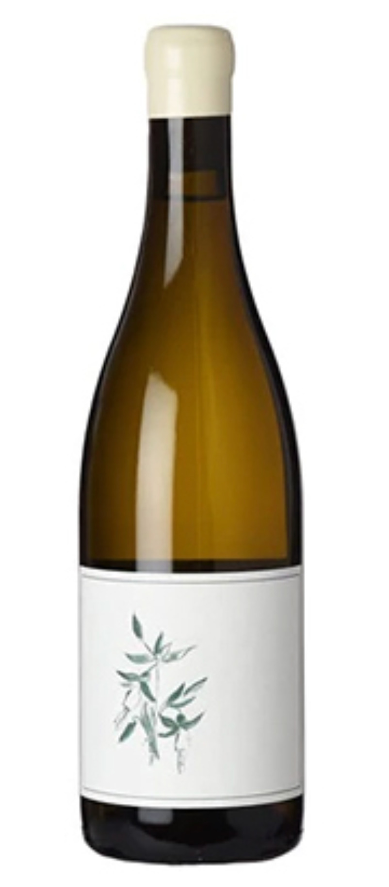
I like Sandlands a lot too. The most basic and utilitarian label imaginable!
It’s basically perfect – probably my favorite new-world label. The wine isn’t bad either. I drank a '17 Trousseau last night. Gorgeous wine.
Arnot-Roberts
It may not be everyone’s cup of tea, but M Krankl does original artwork for every SQN release.
I like this topic a lot. I really agree on the Pergole Torte labels. those are my favorite of any label I own, and Ill keep every bottle as I drink it because of that.
Other labels that I really like:
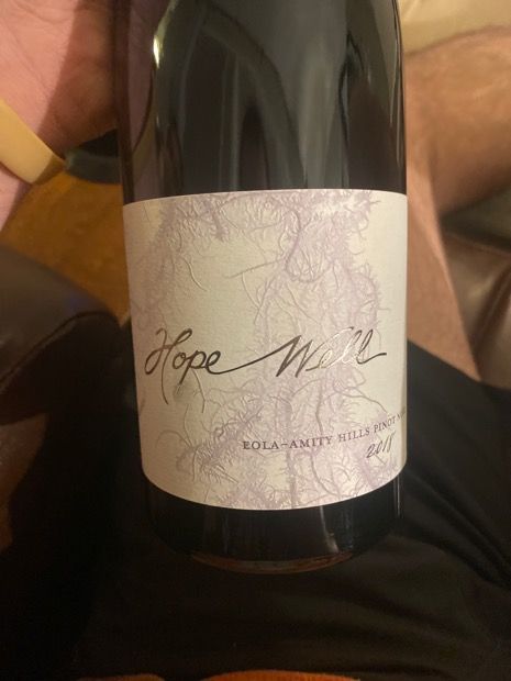
Hope Well Pinot Noir from Mimi Casteel
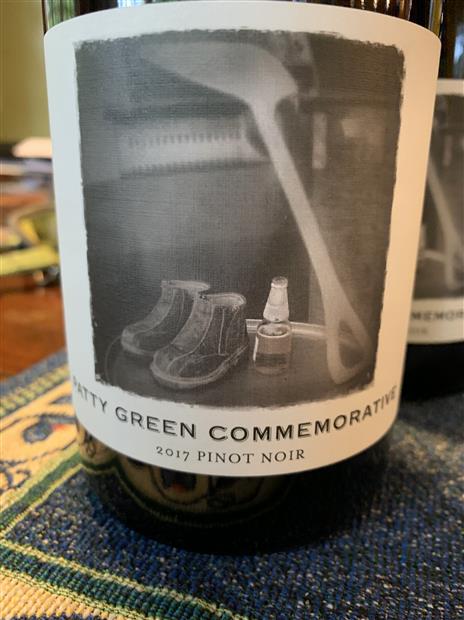
Patty Green Commemorative bottling from Patricia Green
Jolie Laide- especially some of the backstories are cool here
Pax Trousseau Gris
Kelley Fox Barbie Pinot Blanc
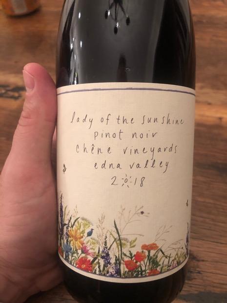
Lady of the Sunshine

oh, also a pretty big fan of the Hiyu labels
I do love the Far Niente label as well - good call.
I am very concerned for the taste of the people who said Rousseau Chambertin is a beautiful label.
Don’t let your judgement be clouded by the wine contained therein, that thing is a gaudy disaster.
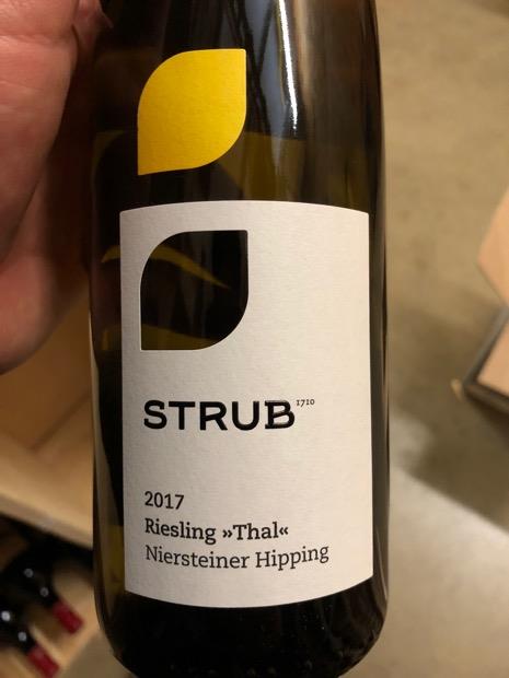
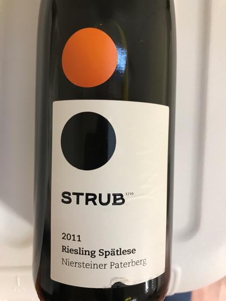
For fans of minimalism and Mondrian-like color choices, Strub rieslings:
haha im with you on this one
Very elegant, I agree Hardy. I’m drinking an '18 D&R Shake Ridge Mourvedre now. I like the purple label - wine is pretty great too!
Wow, thanks for all the responses. I spent the last half hour scrolling the web looking at wine art labels.
Which reminded me that one of the most gorgeous designs got recently changed. I’m talking about Reichsrat von Buhl - from a red/black/white imagine-only label to a taller black/white with lots of negative space. Here is a before/after:

Before

After
I definitely prefer the old one.
1 Like
Always loved the Mondavi I Block label with the frosted glass bottle! ![]()
These are all classic, beautiful, understated font-driven labels. Simple but elegant. Thanks.
Great stuff. They actually did an amazing job at modernising their labels, and I like both the older and the newer versions. Doesn’t happen often.
They remind me of Leeuwin Art Series Chardonnay labels, which also feature an art painting and the written font together. I think I prefer when there’s only the image on the label, it looks cleaner, but they are beautiful nonetheless.
People seem to love or hate here. I like the classic Burgundy-style labels that Rousseau uses for the non-Chambertin bottles. However, with a high-quality picture, one can see the regal beauty of the Chambertin:

Nice labels! What’s the story behind these?
These are all beautiful. I didn’t know Sandlands, which are indeed some of the best new world labels I’ve seen. In terms of new world I also like the minimal By Farr labels from Australia:

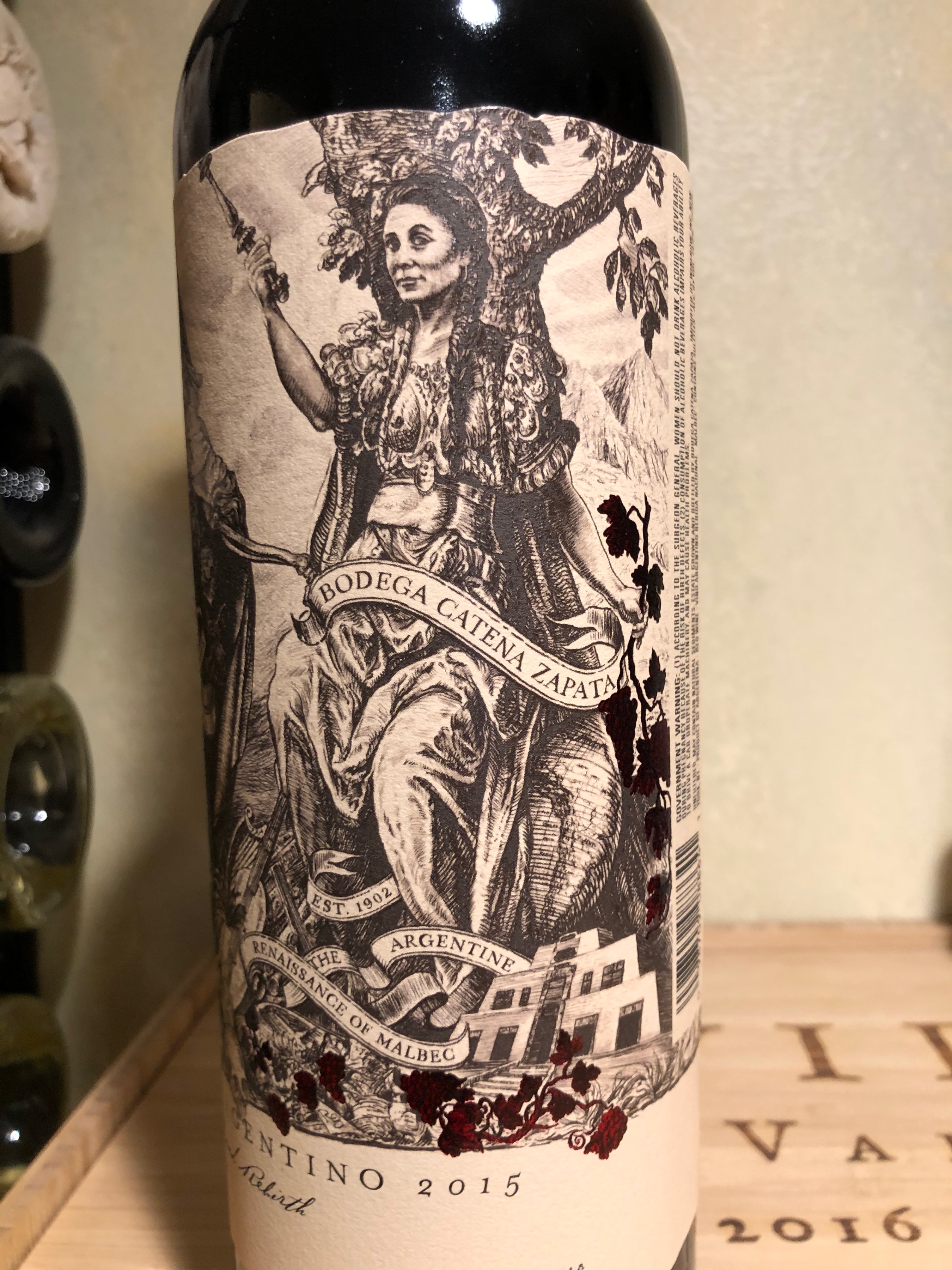
Bodega Catena Zapata has a sweet label.
4 females showing the history of Malbec.
(Only posted the last picture, can show the others if people want to see them)
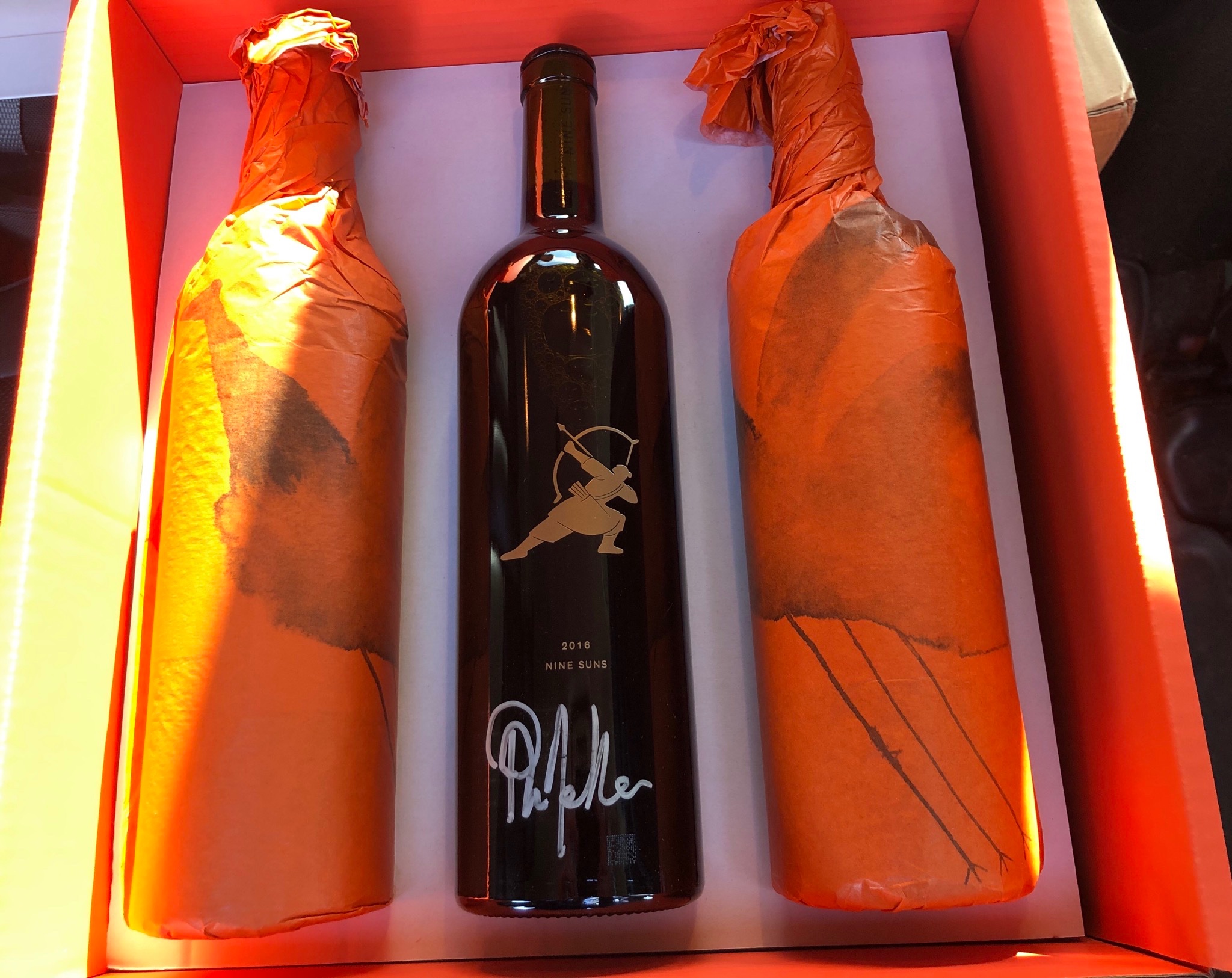
Nine Suns label is simple yet beautiful.
(Maybe it’s the Melka autograph.) ![]()
Grunhaus, Von Buhl, and a Castle (not Schloss) Johannisberg label I recently gifted to David Schildknecht,
or
Dan Kravitz