More label fun:
What world-class wine do you think has a label that doesn’t do the wine justice?
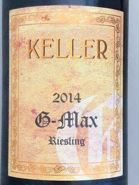
My vote: Keller G-Max
More label fun:
What world-class wine do you think has a label that doesn’t do the wine justice?
My vote: Keller G-Max
Never liked the Arcadian label, but Ridge is an easy winner for the ugly label contest.
The new Vilmart Rubis plain white labels are pretty ugly, too. They were far nicer in holographic pink.
still can’t get over that jean yves bizot uses papyrus font on his label
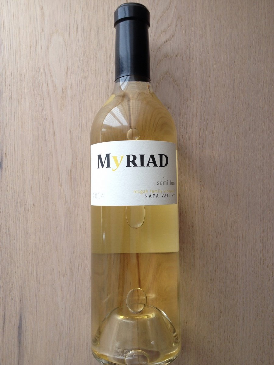
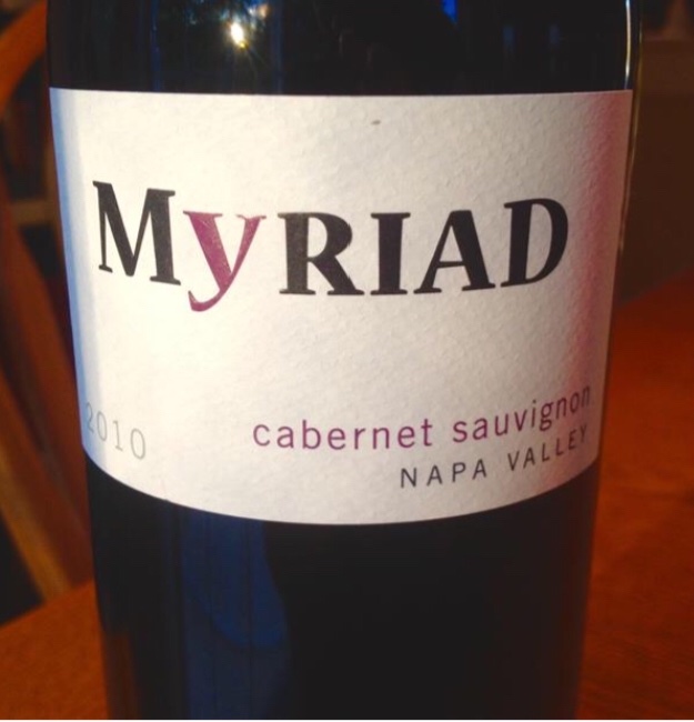
Myriad. Looks like something a kid came up with.
Edit: just realized the post was about great wines. I never had Myriad. Just think their labels are ugly.
What do you think of their Dr. Crane Elysian label? In my opinion, it’s as classy as Harlan Estate.
It’s ok. Ab Lincoln pops in my head. ![]()
Same. Oops. ![]()
No worries. Many would consider Ridge Monte Bello a great wine.
Request: post images of the labels.
FYI, I think Cayuse uses that ugly avatar/papyrus font as well
I have always loved the Ridge label. A classic in my opinion.
Here’s the Myriad semillon.
Why have a yellow “Y” and “mcgah family vineyard” in front of yellow liquid? I get what they are trying to do but my opinion is it’s not good from artistic POV.
Why the boring white label and bad choice of font?
The vintage looks like price of wine.
Agree. The Ridge labels are perfect imo.
Yeah the Cayuse labels are absolute garbage. On the other hand, I sort of think the Hors Categorie labels are so bad they’re good.
Ridge labels are classic, but not in an old world “this wine has been made here since time immemorial” sense, it’s more in a quintessentially American way, like a vintage couch, or the post offices in Los Angeles County that are constructed almost entirely of breeze blocks.
Screagle’s label is pretty crap as is the name.
I also don’t like wines that have pictures of rocks on the label.
I happen to like Arcadian’s labels, they’re also sort of retro, they make me think of early color film credit splash screens. I’m sensing a theme here…
I kinda like the Keller labels…and I actually really like the Ridge labels.
In some cases, I think a producer and or specific wine being great sometimes makes me develop a liking for the label, even if it’s “fugly”
Oh, so one label I do not like at all - Grivot.
also, I think the outer-space looking Laurent Ponsot labels are horrible.
Interesting. I actually like the simplicity of both the Ridge label and the Myriad label.
Agreed. I think it has a timeless classic look and is a great design.
Terrible labels:
Jadot
Bouchard
Grivot
Pacalet
Guillaume Gilles
Alzinger
Mikulski
Dublere
Guigal (anything)
Best Labels:
Roumier
Jayer
Rousseau Chambertin
Chave Hermitage
Ridge
Lopez de Heredia
Hudelot Noellat
Dom Perignon
Knoll
I like the Jadot labels. Bouchard actually just changed their labels, the new ones do look better. I agree, the old ones were pretty bad. Guigal could use some new labels…
I never posted my favorites, so here they are:
Clape
Raveneau
Arnot Roberts
Ceritas
Domaine de la Cote (I really like the maps on the back)
Hofgut Falkenstein
Lafarge
Hudelot Noellat
Rousseau Chambertin
Dagueneau Blanc Fume de Pouilly (music score label)
Willi Schaefer