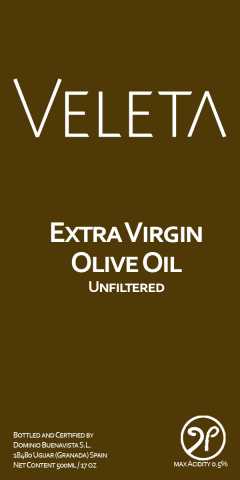
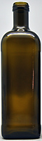
So we are getting new bottles this year that are a dark amber and just a bit taller and a tiny bit more narrow (If Juan gets the price he wants). Closure is probably not going to be cork any longer, it is just too expensive. I am still using the Veleta logo, but and mulling over colors and the rest of the project. I don’t have a lot of time to “think about it” because we will be ready to bottle in the next week or so. I do have some prototypes I am doing in Photoshop and Illustrator. I am leaning towards a darker label, but that’s not set and I would like a photo of the Lechin Olive branch in it.
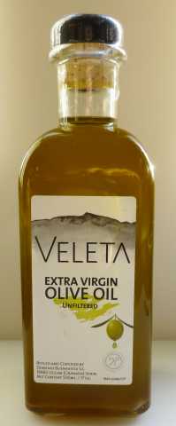
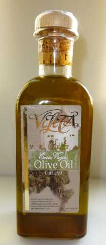
The two labels below are the oldest and the current one that is changing.
Any thoughts or ideas? I am open to suggestions.
Provisional Label (Going Bye Bye)
Old Label (actually the first) Was bye bye a couple of years ago
I have a slight preference for the old label but feel its too cluttered. The Veleta logo on the older label does not appeal to me. If the lettering was solid I would like it more.
The issue I have with the new label is that its too plain for my taste. It looks a bit industrial. I wonder how the old logo would look on the new label.
I would take the new design and print it on a clear label, changing all the black text to white. Get rid of the mountain in the background. I would also back-up the green island thingie in the middle with white so it appears more opaque and get rid of the olive graphic. Let the product sell itself. Sort of a less is more approach. You could add a simple band around the neck if you want room for more text.
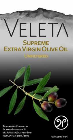
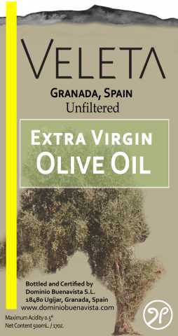
The “New” label of the two was provisional and was really lacking the other was was too crowded. I will look for the same tree that was in the other. Any thoughts on this one?
Please don’t change the pouring part of the spout. That works very well.
It would be good if you can keep Mt. Veleta (the older label) but get more contrast/detail into it the mountain, always looks a bit washed out to me. I also prefer the lettering on the older label, cleaner and less fussy.
But all of that is far less important than the wonderful EVOO! We use it almost every day!
I went back and put some captions on the labels, I was getting confused.
So far Juan likes Sample #1 better than #2
The mountains are important because it is as mentioned above were we take our brand name from the peak Veleta in the Sierra Nevada Granada, Spain.
As an effort to reduce fraud, the producers in Spain (anyway) have asked for a pilfer-proof pour spout. It will be a little different, but I am told it works very similar to the one we were using, but there will not be a cork closure…it is more expensive than the bottle.
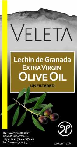
What about wording? Somethings are a given and required by the Junta Andalucia. I am trying to get the point across that it is estate grown trees and produced and bottled by us. Obviously it is unfiltered. I will have a story on the back label, Nutrition Facts, UPC code, seals required…
Ah yes! But if I can make a suggestion (or two), why not replace the bottom picture (actually, I’m not sure what it is–an olive tree?) with the olive branch with olives on it in the label in post 5. Also, the mountain is even dimmer and less distinct in this version–maybe you can lower the rest of the label to expose more of it, or do it like in post 5. Fits more naturally there.
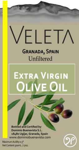
What do you think? The olive branch is Lechin de Granada.
The olive tree is one of ours. They are hundreds of years old and “not groomed”. I actually have one behind the house that they cut to the ground and it is sprouting new branches (the trunk is about 3 ft in diameter).
Ah, like that one even more! But (there is always a but, no?) do you need the stripe on the left? Doesn’t add much and the design is already pretty busy. Also, the mountain is better, but it’s really hard to tell what it is if you don’t already know. How about this or this (you might want to cut off the left part of the second one)? Caution–these might be copyrighted.